您好,登录后才能下订单哦!
密码登录
登录注册
点击 登录注册 即表示同意《亿速云用户服务条款》
这篇文章将为大家详细讲解有关animation属性的使用方法,小编觉得挺实用的,因此分享给大家做个参考,希望大家阅读完这篇文章后可以有所收获。
animation-duration属性
在CSS3中,我们可以使用animation-duration属性来设置动画的持续时间,也就是完成从0%到100%所使用的总时间。animation-duration属性跟CSS3过渡中的transition-duration属性相似。
语法:
animation-duration:时间;
说明:
animation-duration属性取值是一个时间,单位为s(秒),可以为小数如0.5s。
举例:
<!DOCTYPE html>
<html xmlns="http://www.w3.org/1999/xhtml">
<head>
    <title>CSS3 animation-duration属性</title>
    <style type="text/css">
        @-webkit-keyframes mytranslate
        {
            0%{}
            100%{-webkit-transform:translateX(100px);}
        }
        div:not(#container)
        {
            width:40px;
            height:40px;
            border-radius:20px;
            background-color:red;
            -webkit-animation-name:mytranslate;
            -webkit-animation-timing-function:linear;
        }
        #container
        {
            display:inline-block;
            width:140px;
            border:1px solid silver;
        }
        #div1{-webkit-animation-duration:2s;margin-bottom:10px;}
        #div2{-webkit-animation-duration:4s;}
    </style>
</head>
<body>
    <div id="container">
        <div id="div1"></div>
        <div id="div2"></div>
    </div>
</body>
</html>
效果如下:
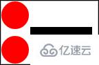
分析:
这个例子中,我们设置#div1的元素动画持续时间为2s,而设置#div2的元素动画持续时间为4s。从在线测试中,我们可以明显看出效果。
这里说一句,CSS3动画很多时候都是跟CSS3变形结合起来,然后实现绚丽复杂的动画效果。
关于animation属性的使用方法就分享到这里了,希望以上内容可以对大家有一定的帮助,可以学到更多知识。如果觉得文章不错,可以把它分享出去让更多的人看到。
免责声明:本站发布的内容(图片、视频和文字)以原创、转载和分享为主,文章观点不代表本网站立场,如果涉及侵权请联系站长邮箱:is@yisu.com进行举报,并提供相关证据,一经查实,将立刻删除涉嫌侵权内容。