您好,登录后才能下订单哦!
密码登录
登录注册
点击 登录注册 即表示同意《亿速云用户服务条款》
这篇文章运用简单易懂的例子给大家介绍使用CSS3实现弹性盒子的布局方式,代码非常详细,感兴趣的小伙伴们可以参考借鉴,希望对大家能有所帮助。
传统的布局方案是依据float,display和position的盒子模型,随着开发语言的完善,弹性盒布局模型成为Web开发人员工具箱中的一个很好的工具,因为摈弃了传统盒子复杂的设置并且可以很完美的契合开发者对于页面兼容性的要求,即当页面需要适应不同的屏幕大小以及设备类型时依然可以确保元素拥有恰当的行为。本篇文章给大家带来的内容是关于如何快速使用弹性盒子布局,有一定的参考价值,有需要的朋友可以参考一下,希望对你有所帮助。
对于弹性盒子的理解
弹性盒子由弹性容器(Flex container)和弹性子元素(Flex item)组成,而弹性容器则可以通过设置 display 属性的值为 flex 或 inline-flex将其定义为弹性容器,其中弹性容器内可以包含了一个或多个弹性子元素。
传统的盒子模型对于那些特殊页面的布局非常的不方便,比如垂直居中,子元素排序的实现就很麻烦。然而随着w3c提出了flex布局,可以简便、完整、响应式地实现各种页面布局,大大的简化了开发过程,并且Flex布局已经得到了所有的浏览器的支持。
弹性盒子的实例
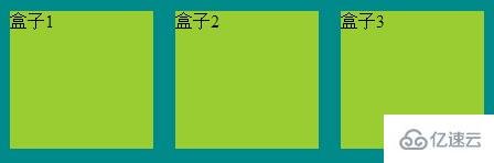
实例一:传统模型
<style>
        .flex-container{
            display: flex;
            display: -webkit-flex;
            width: 450px;
            height: 150px;
            background-color: darkcyan;
                     }
        .flex-item{
            width: 130px;
            height: 125px;
            margin: 10px;
            background-color: yellowgreen;
                 }
    </style>
    <body>
        <div class="flex-container">
            <div class="flex-item one">盒子1</div>
            <div class="flex-item tow">盒子2</div>
            <div class="flex-item three">盒子3</div>
        </div>
    </body>
结构如图所示
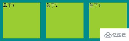
实例二:子元素排序
<style>
        .flex-container{
            display: flex;
            display: -webkit-flex;
            width: 450px;
            background-color: darkcyan;
            flex-direction: row-reverse;
        }
        .flex-item{
            width: 130px;
            height: 125px;
            margin: 10px;
            background-color: yellowgreen;
        }
    </style>
    <body>
        <div class="flex-container">
            <div class="flex-item one">盒子1</div>
            <div class="flex-item tow">盒子2</div>
            <div class="flex-item three">盒子3</div>
        </div>
    </body>
结构如图所示
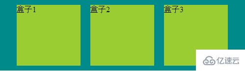
实例三:盒子居中显示
<style>
        .flex-container{
            display: flex;
            display: -webkit-flex;
            width: 500px;
            background-color: darkcyan;
            justify-content: center;
        }
        .flex-item{
            width: 130px;
            height: 125px;
            margin: 10px;
            background-color: yellowgreen;
        }
    </style>
    <body>
        <div class="flex-container">
            <div class="flex-item one">盒子1</div>
            <div class="flex-item tow">盒子2</div>
            <div class="flex-item three">盒子3</div>
        </div>
    </body>
结构如图所示
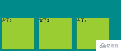
实例四:从底部开始显示
<style>
        .flex-container{
            display: flex;
            display: -webkit-flex;
            width: 500px;
            height: 211px;
            background-color: darkcyan;
            align-items: flex-end;
        }
        .flex-item{
            width: 130px;
            height: 125px;
            margin: 10px;
            background-color: yellowgreen;
        }
    </style>
    <body>
        <div class="flex-container">
            <div class="flex-item one">盒子1</div>
            <div class="flex-item tow">盒子2</div>
            <div class="flex-item three">盒子3</div>
        </div>
    </body>
结构如图所示
以上就是如何使用CSS3实现弹性盒子布局方式的详细内容,更多请关注亿速云其它相关文章!
关于使用CSS3实现弹性盒子的布局方式就分享到这里了,希望以上内容可以对大家有一定的帮助,可以学到更多知识。如果觉得文章不错,可以把它分享出去让更多的人看到。
免责声明:本站发布的内容(图片、视频和文字)以原创、转载和分享为主,文章观点不代表本网站立场,如果涉及侵权请联系站长邮箱:is@yisu.com进行举报,并提供相关证据,一经查实,将立刻删除涉嫌侵权内容。