您好,登录后才能下订单哦!
密码登录
登录注册
点击 登录注册 即表示同意《亿速云用户服务条款》
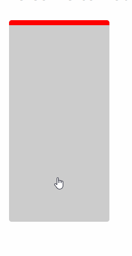
本文实例为大家分享了vue实现鼠标经过动画的具体代码,供大家参考,具体内容如下
详细代码:
<template>
 <div class="hello">
 <h2>{{ msg }}</h2>
 <div class="box">
 <div class="boxchilde" @mouseenter="flag=true" @mouseleave="flag=false">
 <div :class="flag?'passing':''"></div>
 </div>
 </div>
 </div>
</template>

<script>
export default {
 name: 'HelloWorld',
 data () {
 return {
 msg: 'Welcome to Your Vue.js App',
 flag:false
 }
 }
}
</script>

<!-- Add "scoped" attribute to limit CSS to this component only -->
<style scoped>
 .box{
 width: 100%;
 height: 100%;
 }
 .boxchilde{
 display: inline-block;
 margin: 20px;
 width: 200px;
 height: 400px;
 background-color: #ccc;
 border-radius: 5px;
 -webkit-transition: all 0.6s ease-in;
 -moz-transition: all 0.6s ease-in;
 -ms-transition: all 0.6s ease-in;
 -o-transition: all 0.6s ease-in;
 transition: all 0.6s ease-in;
 overflow: hidden;
 }
 .boxchilde:hover{
 cursor: pointer;
 -webkit-transform: translate(0,-10px);
 -moz-transform: translate(0,-10px);
 -ms-transform: translate(0,-10px);
 -o-transform: translate(0,-10px);
 transform: translate(0,-10px);
 }
 .passing {
 width: 100%;
 height: 10px;
 border-top-left-radius: 5px;
 border-top-right-radius: 5px;
 background-color: red;
 animation: passing_4500 0.8s ease-in-out 0s 1 alternate forwards;
 transform-origin: 50% 50%;
 }
 @keyframes passing_4500 {
 0% { transform:translateX(-100%); opacity:0 }
 33.33333% { transform:translateX(-100%); opacity:0 }
 66.66667% { transform:translateX(0%); opacity:1 }
 100% { transform:translateX(0%); opacity:1 }
 }
</style>
更多关于Vue的精彩专题点击下方查看:
Vue.js组件学习教程
Vue.js实战教程
Vue.js前端组件学习教程
以上就是本文的全部内容,希望对大家的学习有所帮助,也希望大家多多支持亿速云。
免责声明:本站发布的内容(图片、视频和文字)以原创、转载和分享为主,文章观点不代表本网站立场,如果涉及侵权请联系站长邮箱:is@yisu.com进行举报,并提供相关证据,一经查实,将立刻删除涉嫌侵权内容。