您好,登录后才能下订单哦!
密码登录
登录注册
点击 登录注册 即表示同意《亿速云用户服务条款》
实例如下:
<!DOCTYPE html>
<html>
<head lang="en">
<meta charset="UTF-8">
<title></title>
<meta name="viewport" content="width=device-width, initial-scale=1">
<link rel="stylesheet" href="css/bootstrap.min.css" rel="external nofollow" />
<script language="JavaScript" src="js/jquery-3.js"></script>
<style type="text/css">
*{
top: 0px;
padding: 0px;
text-decoration: none;
list-style-type: none;
}
.top-styl{
height: 50px;
border: 1px solid red;
background-color: #000000;
}
.img-styl{
width: 174px;
height: 50px;
background: url("imges/logo.png")no-repeat 0px 3px;
background-size: contain;
float: left;
}
.sousuo-styl{
width: 187px;
float: left;
}
.top-search-input{
width: 150px;
padding: 0 5px;
height: 30px;
border: 0;
background: #363636;
float: left;
color: #ccc;
}
.top-search-submit{
width: 30px;
height: 30px;
border: 0;
background: green url("imges/zoom.gif")center center no-repeat;
float: left;
cursor: pointer; //光标指针
}
.dao-styll{
float: left;
font-size: 16px;
width: 329px;
margin-left: 33px;
margin-top: 11px;
}
.dao-styll li{
float: left;
position: relative; //相对定位
text-align: center;
padding: 0 7px;
}
.dao-styll >li:hover{
background-color: #999;
}
.dao-styll >li >a{
color: #FFF;
width: 100%;
height: 34px;
text-decoration: none; //取消下划线
}
.dz-styl{
float: right;
margin: -19px -9px 6px 21px;
}
.imgs-styl{
padding: 11px 0px 0px 114px;
float: right;
margin: 0px -98px -3px 8px;
}
.green-styl{
color: green;
}
.zc-styl{
color: white;
}
a{
text-decoration: none;
}
</style>
</head>
<body>
<div class="container-fluid"> //fluid表示用 百分比
<div class="row"> //row 行
<div class="top-styl col-md-12"> //col-md-12 每行桌面占12列
<div class="row">
<div class=" col-md-offset-1 col-md-9"> //col-md-offset-1 列偏移1列
<div class="row">
<div class="col-md-3 col-xs-4">
<div class="img-styl"></div>
</div>
<div class="col-md-3 ">
<div class="sousuo-styl" >
<input class="top-search-input" value="" type="text"><input
class="top-search-submit" type="submit" value="" />
</div>
</div>
<div class="col-md-4 hidden-xs" >
<ul class="dao-styll">
<li class=""><a href="#" rel="external nofollow" rel="external nofollow" rel="external nofollow" rel="external nofollow" rel="external nofollow" rel="external nofollow" >风格</a>
</li>
<li class=""><a href="#" rel="external nofollow" rel="external nofollow" rel="external nofollow" rel="external nofollow" rel="external nofollow" rel="external nofollow" >造型师</a></li>
<li class=""><a href="#" rel="external nofollow" rel="external nofollow" rel="external nofollow" rel="external nofollow" rel="external nofollow" rel="external nofollow" >众分享</a>
</li>
<li class=""><a href="#" rel="external nofollow" rel="external nofollow" rel="external nofollow" rel="external nofollow" rel="external nofollow" rel="external nofollow" >我的美丽衣橱</a></li>
</ul>
</div>
<div class="col-md-2">
<div class="imgs-styl">
<img src="imges/sina.gif">
</div>
<div class="dz-styl">
<span><a href="#" rel="external nofollow" rel="external nofollow" rel="external nofollow" rel="external nofollow" rel="external nofollow" rel="external nofollow" class="green-styl">登录</a> | </span><span>
<a href="#" rel="external nofollow" rel="external nofollow" rel="external nofollow" rel="external nofollow" rel="external nofollow" rel="external nofollow" class="zc-styl">注册</a></span>
</div>
</div>
</div>
</div>
</div>
</div>
</div>
<div class="row">
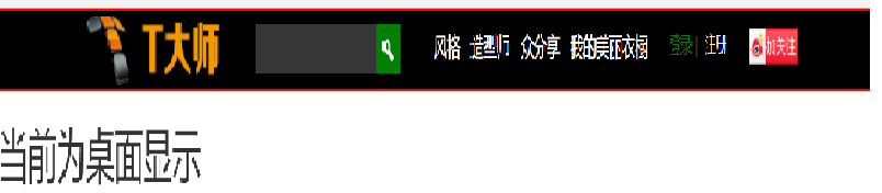
<div class="visible-md"><h2>当前为桌面显示</h2></div> //visible默认占满整行
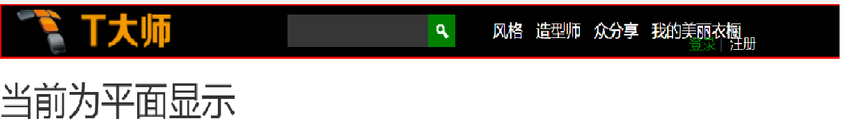
<div class="visible-sm"><h2>当前为平面显示</h2></div>
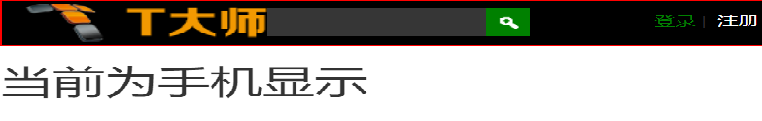
<div class="visible-xs"><h2>当前为手机显示</h2></div>
</div>
</div>
</body>
</html>
效果显示图:
以上这篇响应式框架Bootstrap栅格系统的实例就是小编分享给大家的全部内容了,希望能给大家一个参考,也希望大家多多支持亿速云。
免责声明:本站发布的内容(图片、视频和文字)以原创、转载和分享为主,文章观点不代表本网站立场,如果涉及侵权请联系站长邮箱:is@yisu.com进行举报,并提供相关证据,一经查实,将立刻删除涉嫌侵权内容。