жӮЁеҘҪпјҢзҷ»еҪ•еҗҺжүҚиғҪдёӢи®ўеҚ•е“ҰпјҒ
еҜҶз Ғзҷ»еҪ•
зҷ»еҪ•жіЁеҶҢ
зӮ№еҮ» зҷ»еҪ•жіЁеҶҢ еҚіиЎЁзӨәеҗҢж„ҸгҖҠдәҝйҖҹдә‘з”ЁжҲ·жңҚеҠЎжқЎж¬ҫгҖӢ
Bootstrap жҳҜжңҖеҸ—ж¬ўиҝҺзҡ„ HTMLгҖҒCSS е’Ң JS жЎҶжһ¶пјҢз”ЁдәҺејҖеҸ‘е“Қеә”ејҸеёғеұҖгҖҒ移еҠЁи®ҫеӨҮдјҳе…Ҳзҡ„ WEB йЎ№зӣ®гҖӮ
еӣ дёәBootstrapйңҖиҰҒjqueryзҡ„ж”ҜжҢҒпјҢжүҖд»ҘеңЁдҪҝз”ЁBootstrapд№ӢеүҚиҰҒе…ҲжҠҠjqueryжҸ’件еҜје…ҘпјҢ并且иҰҒжҠҠbootstrap.jsж–Ү件ж”ҫеңЁjquery.jsд№ӢеҗҺж”№еҠЁж–№еҸҜз”ҹж•ҲгҖӮ
Bootstrapдёӯжңүи®ёеӨҡеҘҪз”Ёзҡ„组件пјҢеҸӘиҰҒд»Ҙ规е®ҡзҡ„classзӯүе‘ҪеҗҚе°ұеҸҜд»ҘиҪ»жқҫдҪҝз”ЁиҝҷдәӣжҸ’件гҖӮдҫӢеҰӮпјҡ
еҜјиҲӘжқЎпјҡ
<nav class="navbar navbar-default">
 <div class="container-fluid">
  <!-- Brand and toggle get grouped for better mobile display -->
  <div class="navbar-header">
   <button type="button" class="navbar-toggle collapsed" data-toggle="collapse" data-target="#bs-example-navbar-collapse-1" aria-expanded="false">
    <span class="sr-only">Toggle navigation</span>
    <span class="icon-bar"></span>
    <span class="icon-bar"></span>
    <span class="icon-bar"></span>
   </button>
   <a class="navbar-brand" href="#" rel="external nofollow" rel="external nofollow" rel="external nofollow" rel="external nofollow" rel="external nofollow" rel="external nofollow" rel="external nofollow" rel="external nofollow" rel="external nofollow" rel="external nofollow" rel="external nofollow" rel="external nofollow" rel="external nofollow" rel="external nofollow" rel="external nofollow" >Brand</a>
  </div>

  <!-- Collect the nav links, forms, and other content for toggling -->
  <div class="collapse navbar-collapse" id="bs-example-navbar-collapse-1">
   <ul class="nav navbar-nav">
    <li class="active"><a href="#" rel="external nofollow" rel="external nofollow" rel="external nofollow" rel="external nofollow" rel="external nofollow" rel="external nofollow" rel="external nofollow" rel="external nofollow" rel="external nofollow" rel="external nofollow" rel="external nofollow" rel="external nofollow" rel="external nofollow" rel="external nofollow" rel="external nofollow" >Link <span class="sr-only">(current)</span></a></li>
    <li><a href="#" rel="external nofollow" rel="external nofollow" rel="external nofollow" rel="external nofollow" rel="external nofollow" rel="external nofollow" rel="external nofollow" rel="external nofollow" rel="external nofollow" rel="external nofollow" rel="external nofollow" rel="external nofollow" rel="external nofollow" rel="external nofollow" rel="external nofollow" >Link</a></li>
    <li class="dropdown">
     <a href="#" rel="external nofollow" rel="external nofollow" rel="external nofollow" rel="external nofollow" rel="external nofollow" rel="external nofollow" rel="external nofollow" rel="external nofollow" rel="external nofollow" rel="external nofollow" rel="external nofollow" rel="external nofollow" rel="external nofollow" rel="external nofollow" rel="external nofollow" class="dropdown-toggle" data-toggle="dropdown" role="button" aria-haspopup="true" aria-expanded="false">Dropdown <span class="caret"></span></a>
     <ul class="dropdown-menu">
      <li><a href="#" rel="external nofollow" rel="external nofollow" rel="external nofollow" rel="external nofollow" rel="external nofollow" rel="external nofollow" rel="external nofollow" rel="external nofollow" rel="external nofollow" rel="external nofollow" rel="external nofollow" rel="external nofollow" rel="external nofollow" rel="external nofollow" rel="external nofollow" >Action</a></li>
      <li><a href="#" rel="external nofollow" rel="external nofollow" rel="external nofollow" rel="external nofollow" rel="external nofollow" rel="external nofollow" rel="external nofollow" rel="external nofollow" rel="external nofollow" rel="external nofollow" rel="external nofollow" rel="external nofollow" rel="external nofollow" rel="external nofollow" rel="external nofollow" >Another action</a></li>
      <li><a href="#" rel="external nofollow" rel="external nofollow" rel="external nofollow" rel="external nofollow" rel="external nofollow" rel="external nofollow" rel="external nofollow" rel="external nofollow" rel="external nofollow" rel="external nofollow" rel="external nofollow" rel="external nofollow" rel="external nofollow" rel="external nofollow" rel="external nofollow" >Something else here</a></li>
      <li role="separator" class="divider"></li>
      <li><a href="#" rel="external nofollow" rel="external nofollow" rel="external nofollow" rel="external nofollow" rel="external nofollow" rel="external nofollow" rel="external nofollow" rel="external nofollow" rel="external nofollow" rel="external nofollow" rel="external nofollow" rel="external nofollow" rel="external nofollow" rel="external nofollow" rel="external nofollow" >Separated link</a></li>
      <li role="separator" class="divider"></li>
      <li><a href="#" rel="external nofollow" rel="external nofollow" rel="external nofollow" rel="external nofollow" rel="external nofollow" rel="external nofollow" rel="external nofollow" rel="external nofollow" rel="external nofollow" rel="external nofollow" rel="external nofollow" rel="external nofollow" rel="external nofollow" rel="external nofollow" rel="external nofollow" >One more separated link</a></li>
     </ul>
    </li>
   </ul>
   <form class="navbar-form navbar-left">
    <div class="form-group">
     <input type="text" class="form-control" placeholder="Search">
    </div>
    <button type="submit" class="btn btn-default">Submit</button>
   </form>
   <ul class="nav navbar-nav navbar-right">
    <li><a href="#" rel="external nofollow" rel="external nofollow" rel="external nofollow" rel="external nofollow" rel="external nofollow" rel="external nofollow" rel="external nofollow" rel="external nofollow" rel="external nofollow" rel="external nofollow" rel="external nofollow" rel="external nofollow" rel="external nofollow" rel="external nofollow" rel="external nofollow" >Link</a></li>
    <li class="dropdown">
     <a href="#" rel="external nofollow" rel="external nofollow" rel="external nofollow" rel="external nofollow" rel="external nofollow" rel="external nofollow" rel="external nofollow" rel="external nofollow" rel="external nofollow" rel="external nofollow" rel="external nofollow" rel="external nofollow" rel="external nofollow" rel="external nofollow" rel="external nofollow" class="dropdown-toggle" data-toggle="dropdown" role="button" aria-haspopup="true" aria-expanded="false">Dropdown <span class="caret"></span></a>
     <ul class="dropdown-menu">
      <li><a href="#" rel="external nofollow" rel="external nofollow" rel="external nofollow" rel="external nofollow" rel="external nofollow" rel="external nofollow" rel="external nofollow" rel="external nofollow" rel="external nofollow" rel="external nofollow" rel="external nofollow" rel="external nofollow" rel="external nofollow" rel="external nofollow" rel="external nofollow" >Action</a></li>
      <li><a href="#" rel="external nofollow" rel="external nofollow" rel="external nofollow" rel="external nofollow" rel="external nofollow" rel="external nofollow" rel="external nofollow" rel="external nofollow" rel="external nofollow" rel="external nofollow" rel="external nofollow" rel="external nofollow" rel="external nofollow" rel="external nofollow" rel="external nofollow" >Another action</a></li>
      <li><a href="#" rel="external nofollow" rel="external nofollow" rel="external nofollow" rel="external nofollow" rel="external nofollow" rel="external nofollow" rel="external nofollow" rel="external nofollow" rel="external nofollow" rel="external nofollow" rel="external nofollow" rel="external nofollow" rel="external nofollow" rel="external nofollow" rel="external nofollow" >Something else here</a></li>
      <li role="separator" class="divider"></li>
      <li><a href="#" rel="external nofollow" rel="external nofollow" rel="external nofollow" rel="external nofollow" rel="external nofollow" rel="external nofollow" rel="external nofollow" rel="external nofollow" rel="external nofollow" rel="external nofollow" rel="external nofollow" rel="external nofollow" rel="external nofollow" rel="external nofollow" rel="external nofollow" >Separated link</a></li>
     </ul>
    </li>
   </ul>
  </div><!-- /.navbar-collapse -->
 </div><!-- /.container-fluid -->
</nav>
д»ҘдёҠиҝ°зҡ„ж јејҸеҶҷеҮәйңҖиҰҒзҡ„д»Јз Ғе°ұеҸҜд»ҘиҺ·еҫ—д»ҘдёӢж ·ејҸзҡ„еҜјиҲӘжқЎпјҡ

жіЁпјҡеңЁдёҠиҝ°д»Јз ҒдёӯformиЎЁеҚ•еҚіserchе’ҢsubmitйғЁдҪҚпјҢеёҰжңүclass="dropdown"зҡ„е°ұжҳҜдёӢжӢүиҸңеҚ•зҡ„еҢәеҹҹпјҢclass="dropdown-menu"зҡ„е°ұжҳҜдёӢжӢүиҸңеҚ•зҡ„еҶ…е®№еҢәпјҢиҝҷдәӣйғЁеҲҶ并йқһдё»иҰҒеҶ…е®№пјҢеҸҜд»ҘеҲ йҷӨгҖӮйҖҡиҝҮclass="navbar-right/left/"еҸҜд»Ҙи®ҫзҪ®иҜҘйғЁдҪҚзҡ„еҜјиҲӘжқЎеңЁжҖ»еҢәеҹҹзҡ„е·Ұдҫ§иҝҳжҳҜеҸідҫ§гҖӮ
ж …ж јзі»з»ҹпјҡ
ж …ж јзі»з»ҹжҳҜbootstrapдёӯжңҖдёәйҮҚиҰҒзҡ„йғЁеҲҶпјҢе®ғйҖҡиҝҮ
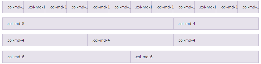
<div class="row">
 <div class="col-md-1">.col-md-1</div>
 <div class="col-md-1">.col-md-1</div>
 <div class="col-md-1">.col-md-1</div>
 <div class="col-md-1">.col-md-1</div>
 <div class="col-md-1">.col-md-1</div>
 <div class="col-md-1">.col-md-1</div>
 <div class="col-md-1">.col-md-1</div>
 <div class="col-md-1">.col-md-1</div>
 <div class="col-md-1">.col-md-1</div>
 <div class="col-md-1">.col-md-1</div>
 <div class="col-md-1">.col-md-1</div>
 <div class="col-md-1">.col-md-1</div>
</div>
<div class="row">
 <div class="col-md-8">.col-md-8</div>
 <div class="col-md-4">.col-md-4</div>
</div>
<div class="row">
 <div class="col-md-4">.col-md-4</div>
 <div class="col-md-4">.col-md-4</div>
 <div class="col-md-4">.col-md-4</div>
</div>
<div class="row">
 <div class="col-md-6">.col-md-6</div>
 <div class="col-md-6">.col-md-6</div>
</div>
иҝҷж ·зҡ„еҪўејҸжқҘе®һзҺ°зҪ‘йЎөеёғеұҖпјҢеҸӘиҰҒи°ғиҠӮclass="col-md-6"е°ұеҸҜд»ҘиҪ»жқҫж”№еҸҳеҚ•е…ғж јеҢәеҹҹзҡ„жҺ’еёғпјҢ
еҰӮеӣҫпјҡ
жіЁпјҡ
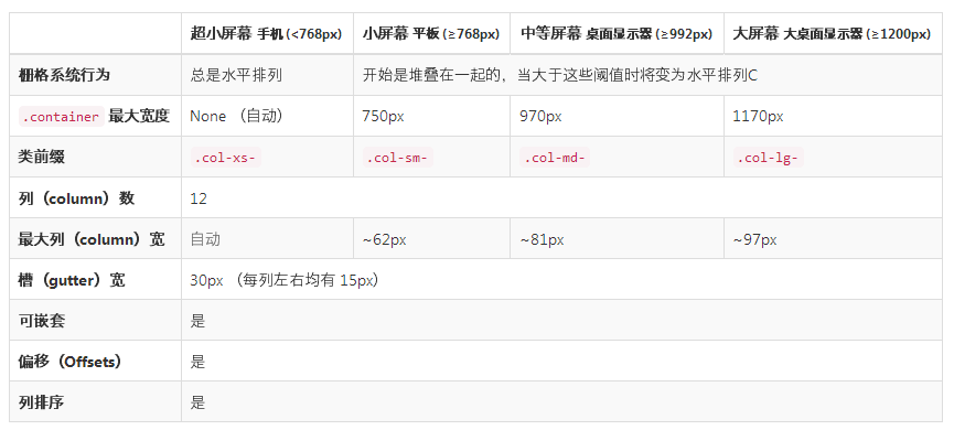
еҰӮдёҠиЎЁпјҡз”ұдәҺbootstrapжҳҜ移еҠЁдјҳе…Ҳзҡ„пјҢжүҖд»ҘеңЁеҲӨе®ҡж—¶е…Ҳд»Һе°ҸеұҸејҖе§ӢпјҢеҰӮcol-xs-6жҢҮзҡ„жҳҜд»Һwidth=768ејҖе§ӢзӣҙеҲ°жңҖеӨ§йғҪжҳҜеҚ 6дёӘеҚ•дҪҚзҡ„з©әй—ҙгҖӮ
д»ҘдёҠе°ұжҳҜжң¬ж–Үзҡ„е…ЁйғЁеҶ…е®№пјҢеёҢжңӣеҜ№еӨ§е®¶зҡ„еӯҰд№ жңүжүҖеё®еҠ©пјҢд№ҹеёҢжңӣеӨ§е®¶еӨҡеӨҡж”ҜжҢҒдәҝйҖҹдә‘гҖӮ
е…ҚиҙЈеЈ°жҳҺпјҡжң¬з«ҷеҸ‘еёғзҡ„еҶ…е®№пјҲеӣҫзүҮгҖҒи§Ҷйў‘е’Ңж–Үеӯ—пјүд»ҘеҺҹеҲӣгҖҒиҪ¬иҪҪе’ҢеҲҶдә«дёәдё»пјҢж–Үз« и§ӮзӮ№дёҚд»ЈиЎЁжң¬зҪ‘з«ҷз«ӢеңәпјҢеҰӮжһңж¶үеҸҠдҫөжқғиҜ·иҒ”зі»з«ҷй•ҝйӮ®з®ұпјҡis@yisu.comиҝӣиЎҢдёҫжҠҘпјҢ并жҸҗдҫӣзӣёе…іиҜҒжҚ®пјҢдёҖз»ҸжҹҘе®һпјҢе°Ҷз«ӢеҲ»еҲ йҷӨж¶үе«ҢдҫөжқғеҶ…е®№гҖӮ
жӮЁеҘҪпјҢзҷ»еҪ•еҗҺжүҚиғҪдёӢи®ўеҚ•е“ҰпјҒ