您好,登录后才能下订单哦!
密码登录
登录注册
点击 登录注册 即表示同意《亿速云用户服务条款》
这篇文章将为大家详细讲解有关Bootstrap表单控件怎么用,小编觉得挺实用的,因此分享给大家做个参考,希望大家阅读完这篇文章后可以有所收获。
具体内容如下
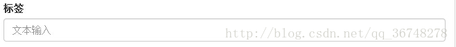
输入框(Input)
最常见的表单文本字段是输入框 input。用户可以在其中输入大多数必要的表单数据。
Bootstrap 提供了对所有原生的 HTML5 的 input 类型的支持,包括:text、password、datetime、datetime-local、date、month、time、week、number、email、url、search、tel 和 color。
<form role="form">
 <div class="form-group">
  <label for="name">标签</label>
  <input type="text" class="form-control" id="name" placeholder="文本输入">
 </div>
</form>
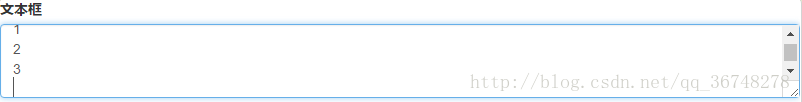
文本框(Textarea)
当您需要进行多行输入的时,则可以使用文本框 textarea。
必要时可以改变 rows 属性(较少的行 = 较小的盒子,较多的行 = 较大的盒子)。(超过这个值就会产生滚动条)
<form role="form">
 <div class="form-group">
  <label for="name">文本框</label>
  <textarea class="form-control" id="name" rows="3"></textarea>
 </div>
</form>
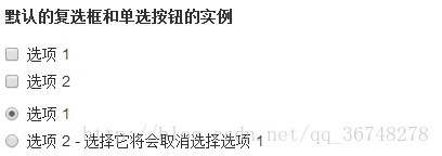
复选框(Checkbox)和单选框(Radio)
(1)复选框和单选按钮用于让用户从一系列预设置的选项中进行选择。
(2)当创建表单时,如果您想让用户从列表中选择若干个选项时,请使用 checkbox。如果您限制用户只能选择一个选项,请使用 radio。
(3)对一系列复选框和单选框使用 .checkbox-inline 或 .radio-inline class,控制它们显示在同一行上。
<label for="name">默认的复选框和单选按钮的实例</label>
<div class="checkbox">
 <label>
  <input type="checkbox" value="">选项1
 </label>
</div>

<div class="checkbox">
 <label>
  <input type="checkbox" value="">选项2
 </label>
</div>

<div class="checkbox">
 <label>
  <input type="checkbox" value="">选项3
 </label>
</div>

<div class="radio">
 <label>
  <input type="radio" name="optionsRadios" id="optionsRadio1" value="options1" checked>选项1
 </label>
</div>

<div class="radio">
 <label>
  <input type="radio" name="optionsRadios" id="optionsRadio2" value="options2" checked>选项2- 选择它将会取消选择选项 1
 </label>
</div>
<label for="name">内联的复选框和单选按钮的实例</label>
<div>
 <label class="checkbox-inline">
  <input type="checkbox" value="">选项1
 </label>

 <label class="checkbox-inline">
  <input type="checkbox" value="">选项2
 </label>

 <label class="checkbox-inline">
  <input type="checkbox" value="">选项3
 </label>

 <label class="radio-inline">
  <input type="radio" name="optionsRadios" id="optionsRadio1" value="options1" checked>选项1
 </label class="radio-inline">

 <label>
  <input type="radio" name="optionsRadios" id="optionsRadio2" value="options2" checked>选项2
 </label>
</div>

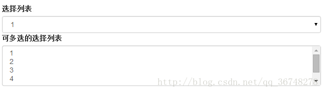
选择框(Select)
(1)当您想让用户从多个选项中进行选择,但是默认情况下只能选择一个选项时,则使用选择框。
(2)使用 <select> 展示列表选项,通常是那些用户很熟悉的选择列表,比如州或者数字。
(3)使用 multiple=”multiple” 允许用户选择多个选项。
<form role="form">
 <div class="form-group>
  <label for="name">选择列表</label>
  <select class="form-control">
   <option>1</option>
   <option>2</option>
   <option>3</option>
   <option>4</option>
   <option>5</option>
  </select>

  <label for="name">可多选的选择列表</label>
  <select class="form-control" multiple>
   <option>1</option>
   <option>2</option>
   <option>3</option>
   <option>4</option>
   <option>5</option>
  </select>
 </div>
</form>
静态控件
需要在一个水平表单内的表单标签后放置纯文本时,请在<p>上使用 class .form-control-static。
<form class="form-horizontal" role="form">
 <div class="form-group">
  <label class="col-sm-2 control-label">Email</label>
  <div class="col-sm-10">
   <p class="form-control-static">email@example.com</p>
  </div>
 </div>

 <div class="form-group">
  <label for="inputPassword" class="col-sm-2 control-label">密码</label>
  <div class="col-sm-10">
   <input type="password" class="form-control" id="inputPassword" placeholder="请输入密码">
  </div>
 </div>
</form>

表单控件状态
(1)除了 :focus 状态(即,用户点击 input 或使用 tab 键聚焦到 input 上),Bootstrap 还为禁用的输入框定义了样式,并提供了表单验证的 class。
(2)输入框焦点:当输入框 input 接收到 :focus 时,输入框的轮廓会被移除,同时应用 box-shadow。
(3)禁用的输入框 input:如果您想要禁用一个输入框 input,只需要简单地添加 disabled 属性,这不仅会禁用输入框,还会改变输入框的样式以及当鼠标的指针悬停在元素上时鼠标指针的样式。
(4)禁用的字段集 fieldset:对 <fieldset> 添加 disabled 属性来禁用 <fieldset> 内的所有控件。
(5)验证状态:Bootstrap 包含了错误、警告和成功消息的验证样式。只需要对父元素简单地添加适当的 class(.has-warning、 .has-error 或 .has-success)即可使用验证状态。
<form class="form-horizontal" role="form">
 <div class="form-group">
  <label class="col-sm-2 control-label">聚焦</label>
  <div class="col-sm-10">
   <input class="form-control" id="focusedInput" type="text" value="该输入框获得焦点...">
  </div>
 </div>

 <div class="form-group">
  <label for="inputPassword" class="col-sm-2 control-label">禁用</label>
  <div class="col-sm-10">
   <input class="form-control" id="disabledInput" type="text" placeholder="该输入框禁止输入..." disabled>
  </div>
 </div>

 <fieldset disabled>
  <div class="form-group">
   <label for="disabledTextInput" class="col-sm-2 control-label">禁用输入(Fieldset disabled)</label>
   <div class="col-sm-10">
    <input type="text" id="disabledTextInput" class="form-control" placeholder="禁止输入">
   </div>
  </div>

  <div class="form-group">
   <label for="disabledSelect" class="col-sm-2 control-label">禁用选择菜单(Fieldset disabled)</label>
   <div class="col-sm-10">
    <select id="disabledSelect" class="form-control">
     <option>禁止选择</option>
    </select>
   </div>
  </div>
 </fieldset>

 <div class="form-group has-success">
  <label class="col-sm-2 control-label" for="inputSuccess">输入成功</label>
  <div class="col-sm-10">
   <input type="text" class="form-control" id="inputSuccess">
  </div>
 </div>

 <div class="form-group has-warning">
  <label class="col-sm-2 control-label" for="inputWarning">输入警告</label>
  <div class="col-sm-10">
   <input type="text" class="form-control" id="inputWarning">
  </div>
 </div>

 <div class="form-group has-error">
  <label class="col-sm-2 control-label" for="inputError">输入错误</label>
  <div class="col-sm-10">
   <input type="text" class="form-control" id="inputError">
  </div>
 </div>
</form>

表单控件大小
可以分别使用 class .input-lg 和 .col-lg-* (<input>)来设置表单的高度和宽度。
关于“Bootstrap表单控件怎么用”这篇文章就分享到这里了,希望以上内容可以对大家有一定的帮助,使各位可以学到更多知识,如果觉得文章不错,请把它分享出去让更多的人看到。
免责声明:本站发布的内容(图片、视频和文字)以原创、转载和分享为主,文章观点不代表本网站立场,如果涉及侵权请联系站长邮箱:is@yisu.com进行举报,并提供相关证据,一经查实,将立刻删除涉嫌侵权内容。