您好,登录后才能下订单哦!
密码登录
登录注册
点击 登录注册 即表示同意《亿速云用户服务条款》
本篇文章给大家分享的是有关Vue中使用component标签解决项目组件化的方法,小编觉得挺实用的,因此分享给大家学习,希望大家阅读完这篇文章后可以有所收获,话不多说,跟着小编一起来看看吧。
1. 首先按照大组件模式开发,功能拆分,统一在大组件中实现所有功能模块的样式 ( 注意:需要在在局部样式覆盖全局样式的条件需要在样式中使用 /deep/ 、 >>> )
<template>
  <div class="filter-input-container">

    <!-- 选项卡 -->
    <div class="filter-line">
      //...
    </div>

    <!-- 时间选择 -->
    <div class="filter-line">
      //...
    </div>

    <!-- 信息列别下拉框 -->
    <div class="filter-line">
      //...
    </div>

    <!-- 搜索表单框 -->
    <div class="filter-line">
      //...
    </div>

  </div>
</template>

<script scoped>
  import { DatePicker, Select, Option, Button, Input } from 'element-ui';
  export default {
    components:{
      'el-date-picker': DatePicker,
      'el-select': Select,
      'el-option': Option,
      'el-button': Button,
      'el-input': Input
    }
  }
</script>

<style scoped lang="stylus">
  @import './stylus/filter-input.styl'
</style>
2. 单个功能组件剥离成单独的组件文件
(1)搜索:fi-search.vue
(2)下拉: fi-select.vue
(3)标签:fi-tab.vue
(4)时间:fi-time.vue
然后在每个单独的组件内设置默认的props值,通过这个值来动态渲染组件和绑定数据,根据组件类别绑定click或者change事件
3. 选择一个下拉功能文件源码示例分析
<template>
  <div class="filter-line">
    <section class="filter-line-title">{{title}}</section>
    <section class="filter-line-content">

       <span class="flc-span-wrap">

        <!-- 下拉框选项卡 -->
        <el-select v-model="contents.value" placeholder="请选择" :class="'selectBox'">
          <el-option
            v-for = "v,i in contents.options"
            :key = "i"
            :label = "v.label"
            :value = "v.value">
          </el-option>
        </el-select>
      </span>

    </section>
  </div>
</template>

<script scoped>

  import { Select, Option } from 'element-ui';

  export default {
    name: 'fi-select',
    data(){
      return {
        selectValue: ''
      }
    },
    props:{
      title:{
        type: String,
        default: '信息类别'
      },
      contents:{
        type: Object,
        default:() => ({
          options: [
            { label: 'show option 1', value: 1 },
            { label: 'show option 2', value: 2 },
            { label: 'show option 3', value: 3 },
            { label: 'show option 4', value: 4 }
          ],
          value: ''
        })
      }
    },
    methods:{

    },
    components:{
      'el-select': Select,
      'el-option': Option
    }
  }
</script>
4. 调用下拉框示例
<component v-bind:is="FiSelect" :title="'任务类别'"></component>
四、 数据渲染和管理的逻辑
我们将通过数据渲染及绑定所有组件内容,所以数据的结构如下:
export const listFilters = [{
title: '工作状态',
type: 'tab',
emit: '',
contents: [
{name:'all',text: '全部'},
{name:'not-issued', text: '未完成'},
{name: 'is-issued',text:'已完成'},
{name: 'is-ended',text: '已结束'}
]
},{
title: '工作时间',
type: 'time',
emit: '',
contents: [
{ type:'tab',name:'all',text: '全部' },
{ type:'tab',name:'today', text: '今天' },
{ type:'tab',name: 'week',text:'一周内' },
{ type:'tab',name: 'week',text:'这个月' },
{ type:'custom',name:'custom',sv:'',ev:'' }
]
},{
title: '来源类别',
type: 'select',
emit: '',
contents: {
options: [
{ label: '类型 1', value: 1 },
{ label: '类型 2', value: 2 },
{ label: '类型 3', value: 3 },
{ label: '类型 4', value: 4 }
],
value: ''
}
},{
title: '网站名称',
type: 'select',
emit: '',
contents: {
options: [
{ label: '腾讯网', value: 1 },
{ label: '新浪网', value: 2 },
{ label: '网易网', value: 3 },
{ label: '凤凰网', value: 4 },
{ label: '搜狐网', value: 5 }
],
value: ''
}
},{
title: '工作搜索',
type: 'search',
contents: {
inputValue: ''
}
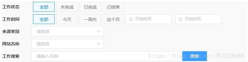
}];五、组件遍历调用渲染
<template>
  <div class="filter-input-container">
    <!-- 最终可以动态调用所有组件 -->
    <component v-bind:is="'fi-'+v.type" :title="v.title" :contents="v.contents" v-for="v,i in listFilters" :key="i"></component>
  </div>
</template>

<script scoped>

  import {listFilters} from './scripts/filters.data.js';

  export default {
    data(){
      return {
        components:['fi-tab','fi-time','fi-select','fi-search','fi-input'],
        listFilters: listFilters
      }
    },
    props:{

    },
    methods:{

    },
    components:{
      'fi-search': () => import('../components/fi-search.vue'), //搜索表单
      'fi-tab': () => import('../components/fi-tab.vue'), // tab切换
      'fi-time': () => import('../components/fi-time.vue'), // 时间选择
      'fi-select': () => import('../components/fi-select.vue') // 选择下拉框
    }
  }
</script>

<style scoped lang="stylus">
  @import './stylus/filter-input.styl'
</style>
六、 最终案例预览效果
补充知识:vue中component组件使用——模块化开发和全局组件
1、模块化开发组件:
box1.vue文件如下:
<template>
 <div class="hello">
  <h2>测试</h2>
 </div>
</template>

<script>
export default {

}
</script>
box2.vue文件如下:import引入box1.vue,components设置,然后设置成标签使用<box1><template>
<div>
  <box1></box1>
 </div>
</template>

<script>
import box1 from '@/components/box1'
export default {
 components: {'box1': box1},
}
</script>
2、全局组建
<div id="example">
 <my-component></my-component>
</div>
// 注册
Vue.component('my-component', {
 template: '<div>A custom component!</div>'
})
// 创建根实例
new Vue({
 el: '#example'
})
渲染为:
<div id="example">
 <div>A custom component!</div>
</div>
以上就是Vue中使用component标签解决项目组件化的方法,小编相信有部分知识点可能是我们日常工作会见到或用到的。希望你能通过这篇文章学到更多知识。更多详情敬请关注亿速云行业资讯频道。
免责声明:本站发布的内容(图片、视频和文字)以原创、转载和分享为主,文章观点不代表本网站立场,如果涉及侵权请联系站长邮箱:is@yisu.com进行举报,并提供相关证据,一经查实,将立刻删除涉嫌侵权内容。