您好,登录后才能下订单哦!
密码登录
登录注册
点击 登录注册 即表示同意《亿速云用户服务条款》
使用Python绘图实现台风路径可视化?相信很多没有经验的人对此束手无策,为此本文总结了问题出现的原因和解决方法,通过这篇文章希望你能解决这个问题。
台风是重大灾害性天气,台风引起的直接灾害通常由三方面造成,狂风、暴雨、风暴潮,除此以外台风的这些灾害极易诱发城市内涝、房屋倒塌、山洪、泥石流等次生灾害。正因如此,台风在科研和业务工作中是研究的重点。希望这次台风路径可视化可以给予大家一点点帮助。
台风路径的获取
中国气象局(CMA)
中国气象局(CMA)的台风最佳路径数据集(BST),BST是之后对历史台风路径进行校正后发布的,其经纬度、强度、气压具有更高的可靠性,但是时间分辨率为6小时,部分3小时,这一点不如观测数据
导入模块并读取数据,使用BST的2018年台风路径数据作为示例,已经将原始的txt文件转换为xls文件。
import os, glob
import pandas as pd
import numpy as np
import shapely.geometry as sgeom
import matplotlib.pyplot as plt
from matplotlib.image import imread
from matplotlib.animation import FuncAnimation
import matplotlib.lines as mlines
import cartopy.crs as ccrs
import cartopy.feature as cfeat
from cartopy.mpl.ticker import LongitudeFormatter,LatitudeFormatter
import cartopy.io.shapereader as shpreader
import cartopy.io.img_tiles as cimgt
from PIL import Image
import warnings
warnings.filterwarnings('ignore')
df = pd.read_csv('./2018typhoon.csv')
定义等级色标
def get_color(level):
  global color
  if level == '热带低压' or level == '热带扰动':
    color='#FFFF00'
  elif level == '热带风暴':
    color='#6495ED'
  elif level == '强热带风暴':
    color='#3CB371'
  elif level == '台风':
    color='#FFA500'
  elif level == '强台风':
    color='#FF00FF'
  elif level == '超强台风':
    color='#DC143C'
  return color
定义底图函数
def create_map(title, extent):
  fig = plt.figure(figsize=(12, 8))
  ax = fig.add_subplot(1, 1, 1, projection=ccrs.PlateCarree())
  url = 'http://map1c.vis.earthdata.nasa.gov/wmts-geo/wmts.cgi'
  layer = 'BlueMarble_ShadedRelief'
  ax.add_wmts(url, layer)
  ax.set_extent(extent,crs=ccrs.PlateCarree())

  gl = ax.gridlines(draw_labels=False, linewidth=1, color='k', alpha=0.5, linestyle='--')
  gl.xlabels_top = gl.ylabels_right = False
  ax.set_xticks(np.arange(extent[0], extent[1]+5, 5))
  ax.set_yticks(np.arange(extent[2], extent[3]+5, 5))
  ax.xaxis.set_major_formatter(LongitudeFormatter())
  ax.xaxis.set_minor_locator(plt.MultipleLocator(1))
  ax.yaxis.set_major_formatter(LatitudeFormatter())
  ax.yaxis.set_minor_locator(plt.MultipleLocator(1))
  ax.tick_params(axis='both', labelsize=10, direction='out')

  a = mlines.Line2D([],[],color='#FFFF00',marker='o',markersize=7, label='TD',ls='')
  b = mlines.Line2D([],[],color='#6495ED', marker='o',markersize=7, label='TS',ls='')
  c = mlines.Line2D([],[],color='#3CB371', marker='o',markersize=7, label='STS',ls='')
  d = mlines.Line2D([],[],color='#FFA500', marker='o',markersize=7, label='TY',ls='')
  e = mlines.Line2D([],[],color='#FF00FF', marker='o',markersize=7, label='STY',ls='')
  f = mlines.Line2D([],[],color='#DC143C', marker='o',markersize=7, label='SSTY',ls='')
  ax.legend(handles=[a,b,c,d,e,f], numpoints=1, handletextpad=0, loc='upper left', shadow=True)
  plt.title(f'{title} Typhoon Track', fontsize=15)
  return ax
定义绘制单个台风路径方法,并绘制2018年第18号台风温比亚。
def draw_single(df):
  ax = create_map(df['名字'].iloc[0], [110, 135, 20, 45])
  for i in range(len(df)):
    ax.scatter(list(df['经度'])[i], list(df['纬度'])[i], marker='o', s=20, color=get_color(list(df['强度'])[i]))

  for i in range(len(df)-1):
    pointA = list(df['经度'])[i],list(df['纬度'])[i]
    pointB = list(df['经度'])[i+1],list(df['纬度'])[i+1]
    ax.add_geometries([sgeom.LineString([pointA, pointB])], color=get_color(list(df['强度'])[i+1]),crs=ccrs.PlateCarree())
  plt.savefig('./typhoon_one.png')
draw_single(df[df['编号']==1818])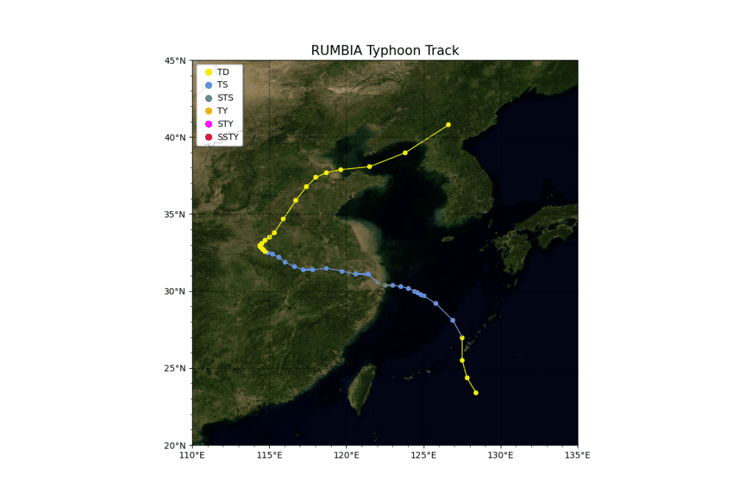
定义绘制多个台风路径方法,并绘制2018年全年的全部台风路径。
def draw_multi(df):
  L = list(set(df['编号']))
  L.sort(key=list(df['编号']).index)
  ax = create_map('2018', [100, 180, 0, 45])
  for number in L:
    df1 = df[df['编号']==number]
    for i in range(len(df1)-1):
      pointA = list(df1['经度'])[i],list(df1['纬度'])[i]
      pointB = list(df1['经度'])[i+1],list(df1['纬度'])[i+1]
      ax.add_geometries([sgeom.LineString([pointA, pointB])], color=get_color(list(df1['强度'])[i+1]),crs=ccrs.PlateCarree())
  plt.savefig('./typhoon_multi.png')
draw_multi(df)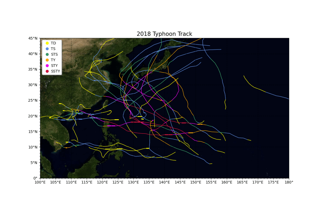
定义绘制单个台风gif路径演变方法,并绘制2018年第18号台风的gif路径图。
def draw_single_gif(df):
  for state in range(len(df.index))[:]:
    ax = create_map(f'{df["名字"].iloc[0]} {df["时间"].iloc[state]}', [110, 135, 20, 45])
    for i in range(len(df[:state])):
      ax.scatter(df['经度'].iloc[i], df['纬度'].iloc[i], marker='o', s=20, color=get_color(df['强度'].iloc[i]))
    for i in range(len(df[:state])-1):
      pointA = df['经度'].iloc[i],df['纬度'].iloc[i]
      pointB = df['经度'].iloc[i+1],df['纬度'].iloc[i+1]
      ax.add_geometries([sgeom.LineString([pointA, pointB])], color=get_color(df['强度'].iloc[i+1]),crs=ccrs.PlateCarree())
    print(f'正在绘制第{state}张轨迹图')
    plt.savefig(f'./{df["名字"].iloc[0]}{str(state).zfill(3)}.png', bbox_inches='tight')
  # 将图片拼接成动画
  imgFiles = list(glob.glob(f'./{df["名字"].iloc[0]}*.png'))
  images = [Image.open(fn) for fn in imgFiles]
  im = images[0]
  filename = f'./track_{df["名字"].iloc[0]}.gif'
  im.save(fp=filename, format='gif', save_all=True, append_images=images[1:], duration=500)
draw_single_gif(df[df['编号']==1818])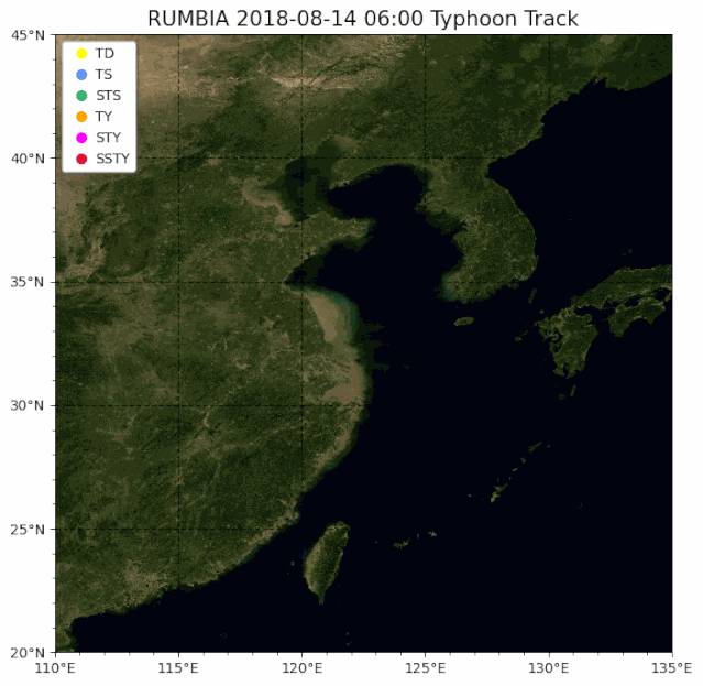
看完上述内容,你们掌握使用Python绘图实现台风路径可视化的方法了吗?如果还想学到更多技能或想了解更多相关内容,欢迎关注亿速云行业资讯频道,感谢各位的阅读!
免责声明:本站发布的内容(图片、视频和文字)以原创、转载和分享为主,文章观点不代表本网站立场,如果涉及侵权请联系站长邮箱:is@yisu.com进行举报,并提供相关证据,一经查实,将立刻删除涉嫌侵权内容。