您好,登录后才能下订单哦!
密码登录
登录注册
点击 登录注册 即表示同意《亿速云用户服务条款》
小编给大家分享一下MinUI组件之abnor异常流组件的示例分析,相信大部分人都还不怎么了解,因此分享这篇文章给大家参考一下,希望大家阅读完这篇文章后大有收获,下面让我们一起去了解一下吧!
MinUI 组件库包含了很多功能组件,其中 abnor 异常流组件是一个很常用的功能性组件, MinUI 中 abnor 组件的效果图如下:

各式各样的类型都有哦,是不是看起来很方便很快捷的样子(^_^)。可以打开微信扫一扫下面的小程序二维码先一睹为快:

下面介绍 abnor 组件的使用方式。
1、使用下列命令安装 Min-Cli,如已安装,请进入到下一步。Min-Cli 的文档请猛戳这里:Min-Cli使用手册
npm install -g @mindev/min-cli
2、初始化一个小程序项目。
min init my-project
选择 新建小程序 选项,即可初始化一个小程序项目。创建项目后,在编辑器中打开项目,src 目录为源码目录,dist 目录为编译后用于在微信开发者工具中指定的目录。新建的项目中已有一个 home 页面。详细文档:Min 初始化小程序项目
3、安装 abnor 组件。
进入刚才新建的小程序项目的目录中:
cd my-project
安装组件:
min install @minui/wxc-abnor
4、开启dev。
min dev
开启之后,修改源码后都会重新编译。
5、在页面中引入组件。
在编辑器中打开 src/pages 目录下的 home/index.wxp 文件,在 script 中添加 config 字段,配置小程序自定义组件字段,代码如下:
export default {
    config: {
        "usingComponents": {
            'wxc-abnor': "@minui/wxc-abnor"
        }
    }
}
wxc-abnor 即为异常流组件的标签名,可以在 wxml 中使用。
6、在 wxml 中使用 wxc-abnor标签。
在 home/index.wxp 文件的 template 中添加 wxc-abnor 标签,代码如下:
<wxc-abnor type="SHOP"></wxc-abnor>
7、打开微信开发者工具,指定 dist 目录,预览项目。
home/index.wxp 文件的代码如下所示:
<!-- home/index.wxp -->
<template>
  <wxc-abnor type="SHOP"></wxc-abnor>
</template>

<script>
  export default {
    config: {
      usingComponents: {
        'wxc-abnor': '@minui/wxc-abnor'
      }
    },
    data: {}
  }
</script>

<style>
</style>
图示:
至此,minui 组件库的 abnor 异常流组件在 Min 工具生成的小程序项目中的方法已介绍完毕,其他场景,在原生小程序或其他小程序框架项目中的使用方式请移步至如下链接:
在已有小程序项目中使用 MinUI 组件介绍
了解组件的使用方式后,下面开始介绍 abnor 组件的 API 。
Abnor【props】
| 名称 | 描述 |
|---|---|
type | [说明]:异常状态类型,其优先级低于其他属性。 [类型]: String默认值: "" [可选值]: REQUEST_ERROR, NOT_FOUND, DATA, FOLLOW, FEED,SHOP, WEIBO, SEARCH, TAG, MESSAGE, LIVE, ORDER, CART, FOOTPRINT, COUPON |
image | [说明]:背景图。若与 type 同时指定,将覆盖 type 对应的 image 。[类型]: String[默认值]: "" |
title | [说明]:标题。若与 type 同时指定,将覆盖 type 对应的 title 。[类型]: String[默认值]: "" |
tip | [说明]:副标题。若与 type 同时指定,将覆盖 type 对应的 tip 。[类型]: String[默认值]: "" |
button | [说明]:按钮文案。若与 type 同时指定,将覆盖 type 对应的 button 。[类型]: String[默认值]: "" |
bindabnortap | [说明]:按钮事件。若配置了 button 属性,则需要指定事件。其中 REQUEST_ERROR, NOT_FOUND 两种 type 中均设置了默认的按钮文案 |
更多demo
1、网络异常
<template>
  <wxc-abnor type="REQUEST_ERROR" bind:abnortap="onAbnorTap"></wxc-abnor>
</template>

<script>
export default {
  config: {
    usingComponents: {
      'wxc-abnor': '@minui/wxc-abnor'
    }
  },
  data: {},
  onAbnorTap() {
      wx.showToast({
        title: 'success',
        duration: 2000
      });
    }
}
</script>

<style>
</style>
图示:

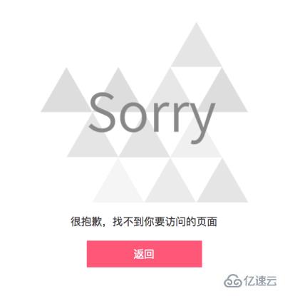
2、页面不存在
<template>
  <wxc-abnor type="NOT_FOUND" bind:abnortap="onAbnorTap"></wxc-abnor>
</template>

<script>
  export default {
    config: {
      usingComponents: {
        'wxc-abnor': '@minui/wxc-abnor'
      }
    },
    data: {},
    onAbnorTap() {
        wx.showToast({
          title: 'back',
          duration: 2000
        });
      }
  }
</script>

<style>
</style>
图示:
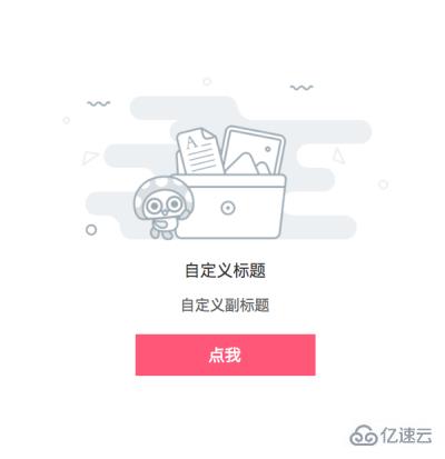
3、自定义数据
<template>
  <wxc-abnor
    type="REQUEST_ERROR"
    image="{{image}}"
    title="{{title}}"
    tip="{{tip}}"
    button="{{button}}"
    bind:abnortap="onAbnorTap"
  ></wxc-abnor>
</template>

<script>
  export default {
    config: {
      usingComponents: {
        'wxc-abnor': '@minui/wxc-abnor'
      }
    },
    data: {
      image: 'https://s10.mogucdn.com/p2/161213/upload_76h2c5hjc8heecjehlfgekjdl2ki0_514x260.png',
      title: '自定义标题',
      tip: '自定义副标题',
      button: '点我'
    },
    onAbnorTap() {
        wx.showToast({
          title: 'custom',
          duration: 2000
        });
      }
  }
</script>

<style>
</style>
图示:
4、空数据状态
<template>
  <wxc-abnor type="DATA"></wxc-abnor>
</template>

<script>
  export default {
    config: {
      usingComponents: {
        'wxc-abnor': '@minui/wxc-abnor'
      }
    },
    data: {}
  }
</script>

<style>
</style>
图示:

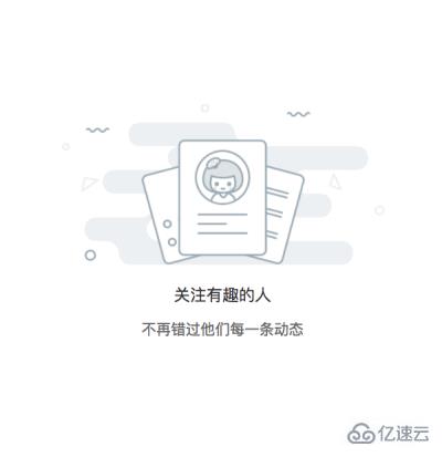
5、无关注数据
<template>
  <wxc-abnor type="FOLLOW"></wxc-abnor>
</template>

<script>
  export default {
    config: {
      usingComponents: {
        'wxc-abnor': '@minui/wxc-abnor'
      }
    },
    data: {},
    methods: {}
  }
</script>

<style>
</style>
图示:
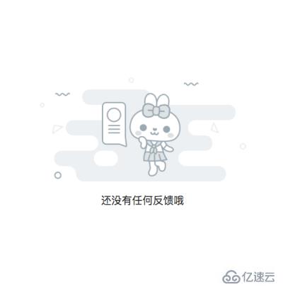
6、无反馈数据
<template>
  <wxc-abnor type="FOLLOW"></wxc-abnor>
</template>

<script>
  export default {
    config: {
      usingComponents: {
        'wxc-abnor': '@minui/wxc-abnor'
      }
    },
    data: {}
  }
</script>

<style>
</style>
图示:
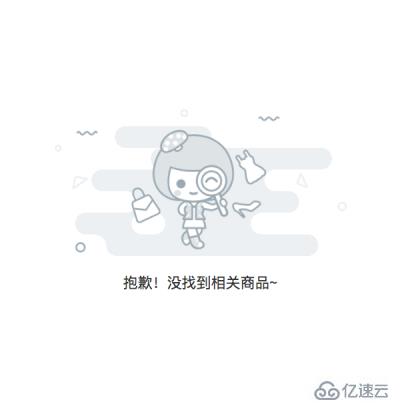
7、无搜索数据
<template>
  <wxc-abnor type="SEARCH"></wxc-abnor>
</template>

<script>
  export default {
    config: {
      usingComponents: {
        'wxc-abnor': '@minui/wxc-abnor'
      }
    },
    data: {}
  }
</script>

<style>
</style>
图示:
8、无消息通知
<template>
  <wxc-abnor type="FOLLOW"></wxc-abnor>
</template>

<script>
  export default {
    config: {
      usingComponents: {
        'wxc-abnor': '@minui/wxc-abnor'
      }
    },
    data: {}
  }
</script>

<style>
</style>
图示:

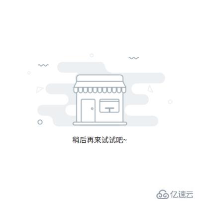
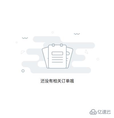
9、空订单列表
<template>
  <wxc-abnor type="ORDER"></wxc-abnor>
</template>

<script>
  export default {
    config: {
      usingComponents: {
        'wxc-abnor': '@minui/wxc-abnor'
      }
    },
    data: {}
  }
</script>

<style>
</style>
图示:
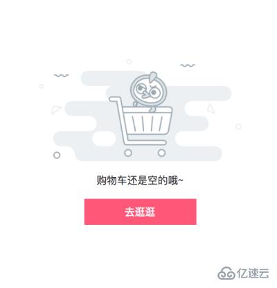
10、空购物车
<template>
  <wxc-abnor type="CART"></wxc-abnor>
</template>

<script>
  export default {
    config: {
      usingComponents: {
        'wxc-abnor': '@minui/wxc-abnor'
      }
    },
    data: {}
  }
</script>

<style>
</style>
图示:
11、空足迹
<template>
  <wxc-abnor type="FOOTPRINT"></wxc-abnor>
</template>

<script>
  export default {
    config: {
      usingComponents: {
        'wxc-abnor': '@minui/wxc-abnor'
      }
    },
    data: {}
  }
</script>

<style>
</style>
图示:

12、无优惠券数据
<template>
  <wxc-abnor type="COUPON"></wxc-abnor>
</template>

<script>
  export default {
    config: {
      usingComponents: {
        'wxc-abnor': '@minui/wxc-abnor'
      }
    },
    data: {}
  }
</script>

<style>
</style>
图示:

以上是“MinUI组件之abnor异常流组件的示例分析”这篇文章的所有内容,感谢各位的阅读!相信大家都有了一定的了解,希望分享的内容对大家有所帮助,如果还想学习更多知识,欢迎关注亿速云行业资讯频道!
免责声明:本站发布的内容(图片、视频和文字)以原创、转载和分享为主,文章观点不代表本网站立场,如果涉及侵权请联系站长邮箱:is@yisu.com进行举报,并提供相关证据,一经查实,将立刻删除涉嫌侵权内容。