您好,登录后才能下订单哦!
密码登录
登录注册
点击 登录注册 即表示同意《亿速云用户服务条款》
小编给大家分享一下css径向渐变的使用方法,相信大部分人都还不怎么了解,因此分享这篇文章给大家参考一下,希望大家阅读完这篇文章后大有收获,下面让我们一起去了解一下吧!
css径向渐变的使用方法:首先创建一个HTML示例文件;然后创建一个div块;最后通过添加css样式为“background:radial-gradient()”来实现径向渐变效果即可。
径向渐变(radial gradients):从起点到终点颜色从内而外沿进行圆形渐变。
语法
background:radial-gradient(center,shape size,start-color,……,last-color);
径向渐变-设置形状
语法:
background:radial-gradient(shape,start-color,……,last-color);
说明:
shape值可以取两个
circle——圆形
ellipse——椭圆(默认)
径向渐变-尺寸大小关键字
尺寸大小关键字是确定结束颜色的位置,默认值为farthest-corner。
语法
background:radial-gradient(size,start-color,……,last-color);
size取值为以下四个关键字:
closest-side:最近边
farthest-side:最远边
closest-corner:最近角
farthest-corner:最远角
实例:
div {
     width: 300px;
     height: 200px;
     /* Safari 5.1 - 6.0 */
     background: -webkit-radial-gradient(30% 70%, farthest-side, blue, green, yellow, black);
     /* Opera 11.6 - 12.0 */
     background: -o-radial-gradient(30% 70%, farthest-side, blue, green, yellow, black);
     /* Firefox 3.6 - 15 */
     background: -moz-radial-gradient(30% 70%, farthest-side, blue, green, yellow, black);
     /* 标准的语法 */
     background: radial-gradient(30% 70%, farthest-side, blue, green, yellow, black);
   }
径向渐变-圆心位置
语法:
background:radial-gradient(level-percent vertical-percent,start-color,……,last-color);
注意:圆心位置的标准语法目前主流浏览器支持性较差,需要注意加浏览器前缀。
一般使用时的方式:
-webkit-background:radial-gradient(level-percent vertical-percent,start-color,……,last-color);
-o-background:radial-gradient(level-percent vertical-percent,start-color,……,last-color);
-moz-background:radial-gradient(level-percent vertical-percent,start-color,……,last-color);
background:radial-gradient(level-percent vertical-percent,start-color,……,last-color);
思考:1、渐变中颜色后面百分比值有何含义?
3-12编程练习
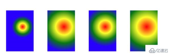
小伙伴们,学习了CSS3径向渐变,根据效果图,补充代码,实现:
(1)以中心(60% 40%)为起点,设置圆心到最近边、最圆边、最近角、最圆角的四种径向渐变效果。
(2)径向渐变的形状是圆形
(3)颜色由里到外分别是红、黄、绿、蓝
效果图如下
任务
给4个元素分别设置背景颜色径向渐变
(1)分别设置径向渐变大小为最近边、最远边、最近角、最远角
(2)渐变的圆心为60%和40%
(3)渐变的形状为圆形
(4)渐变的颜色由里到外依次为红、黄、绿、蓝。
参考代码:
<!DOCTYPE html>
<html>

<head>
    <meta charset="UTF-8">
    <meta name="viewport" content="width=device-width,initial-scale=1,maximum-scale=1,user-scalable=no">

    <title>径向渐变</title>
    <style>
        div {
            width: 200px;
            height: 300px;
            float: left;
            margin: 100px 0 0 100px;
        }

        /* 补充代码,分别写出4个元素的背景渐变效果 */

        .div1 {
            background: -webkit-radial-gradient(60% 40%,closest-side circle, red,yellow,green,blue);
            /* Opera 11.6 - 12.0 */
            background: -o-radial-gradient(60% 40%,closest-side circle, red,yellow,green,blue);
            /* Firefox 3.6 - 15 */
            background: -moz-radial-gradient(60% 40%,closest-side circle, red,yellow,green,blue);
            /* 标准的语法 */
            background: radial-gradient(60% 40%,closest-side circle, red,yellow,green,blue);
        }
        .div2 {
            background: -webkit-radial-gradient(60% 40%,farthest-side circle, red,yellow,green,blue);
            /* Opera 11.6 - 12.0 */
            background: -o-radial-gradient(60% 40%,farthest-side circle, red,yellow,green,blue);
            /* Firefox 3.6 - 15 */
            background: -moz-radial-gradient(60% 40%,farthest-side circle, red,yellow,green,blue);
            /* 标准的语法 */
            background: radial-gradient(60% 40%,farthest-side circle, red,yellow,green,blue);
        }
        .div3 {
            background: -webkit-radial-gradient(60% 40%,closest-corner circle, red,yellow,green,blue);
            /* Opera 11.6 - 12.0 */
            background: -o-radial-gradient(60% 40%,closest-corner circle, red,yellow,green,blue);
            /* Firefox 3.6 - 15 */
            background: -moz-radial-gradient(60% 40%,closest-corner circle, red,yellow,green,blue);
            /* 标准的语法 */
            background: radial-gradient(60% 40%,closest-corner circle, red,yellow,green,blue);
        }
        .div4 {
            background: -webkit-radial-gradient(60% 40%,farthest-corner circle, red,yellow,green,blue);
            /* Opera 11.6 - 12.0 */
            background: -o-radial-gradient(60% 40%,farthest-corner circle, red,yellow,green,blue);
            /* Firefox 3.6 - 15 */
            background: -moz-radial-gradient(60% 40%,farthest-corner circle, red,yellow,green,blue);
            /* 标准的语法 */
            background: radial-gradient(60% 40%,farthest-corner circle, red,yellow,green,blue);
        }
    </style>
</head>

<body>
    <div></div>
    <div></div>
    <div></div>
    <div></div>
</body>

</html>
径向渐渐-重复渐变
background:repeating-radial-gradient(color1 length|percent,color2 length|percent,……);
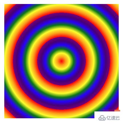
3-14编程练习
小伙伴们,我们学习了CSS3径向渐变中的重复渐变,接下来,根据效果图写出代码,实现以元素中心为原点进行多个彩虹球的重复径向渐变。
(1)要求彩虹的7个颜色,取值范围从0%开始,一次加5%,比如红色是0%,橙色是5%,黄色是10%,依次类推
(2)提示:彩虹球的颜色,用英语单词表示即可
(3)效果图如下:
参考代码:
<!DOCTYPE html>
<html>

<head>
    <meta charset="UTF-8">
    <meta name="viewport" content="width=device-width,initial-scale=1,maximum-scale=1,user-scalable=no">

    <title>径向渐变</title>
    <style>
        div {
            width: 400px;
            height: 400px;
            /* 补充代码 */
            background: -webkit-repeating-radial-gradient(closest-side circle, red 0%,orange 5%,yellow 10%,green 15%,blue 20%,indigo 25%,purple 30%);
            /* Opera 11.6 - 12.0 */
            background: -o-repeating-radial-gradient( closest-side circle,red 0%,orange 5%,yellow 10%,green 15%,blue 20%,indigo 25%,purple 30%);
            /* Firefox 3.6 - 15 */
            background: -moz-repeating-radial-gradient(closest-side circle,red 0%,orange 5%,yellow 10%,green 15%,blue 20%,indigo 25%,purple 30%);
            /* 标准的语法 */
            background: repeating-radial-gradient( closest-side circle, red 0%,orange 5%,yellow 10%,green 15%,blue 20%,indigo 25%,purple 30%);
        }
    </style>
</head>

<body>
    <div></div>

</body>

</html>
以上是“css径向渐变的使用方法”这篇文章的所有内容,感谢各位的阅读!相信大家都有了一定的了解,希望分享的内容对大家有所帮助,如果还想学习更多知识,欢迎关注亿速云行业资讯频道!
免责声明:本站发布的内容(图片、视频和文字)以原创、转载和分享为主,文章观点不代表本网站立场,如果涉及侵权请联系站长邮箱:is@yisu.com进行举报,并提供相关证据,一经查实,将立刻删除涉嫌侵权内容。