您好,登录后才能下订单哦!
密码登录
登录注册
点击 登录注册 即表示同意《亿速云用户服务条款》
小编给大家分享一下怎样使用CSS实现盒子水平垂直居中,相信大部分人都还不怎么了解,因此分享这篇文章给大家参考一下,希望大家阅读完这篇文章后大有收获,下面让我们一起去了解一下吧!
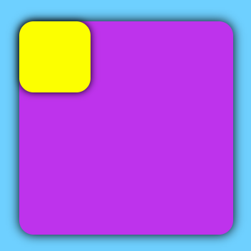
原始代码:
center.html:
<!DOCTYPE html>
<html lang="Zh">

<head>
    <meta charset="UTF-8">
    <meta name="viewport" content="width=device-width, initial-scale=1.0">
    <title>Center</title>
    <link rel="stylesheet" href="center.css">
</head>

<body>
    <div class="father">
        <div class="son"></div>
    </div>
</body>

</html>
center.css:
body {
    background-color: #6ed0ff;
}

.father {
    background-color: #be33ec;
    border-radius: 20px;
    box-shadow: 0 0 15px rgb(0, 0, 0);
    margin: 100px auto;
    width: 300px;
    height: 300px;
}

.son {
    background-color: #fcff00;
    border-radius: 20px;
    box-shadow: 0 0 10px rgb(0, 0, 0);
    width: 100px;
    height: 100px;
}
原始效果:
实现子盒子相对于父盒子垂直居中效果:
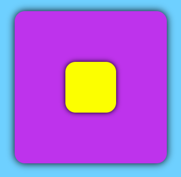
1. grid
.father {
    display: grid;
}

.son {
    align-self: center;
    justify-self: center;
}
2. absolute + 负margin
.father {
    position: relative;
}

.son {
    position: absolute;
    left: 50%;
    top: 50%;
    margin-left: -50px;
    margin-top: -50px;
}
3. absolute + transform
.father {
    position: relative;
}

.son {
    position: absolute;
    left: 50%;
    top: 50%;
    transform: translate(-50%, -50%);
}
4. absolute + margin: auto
.father {
    position: relative;
}

.son {
    position: absolute;
    left: 0;
    right: 0;
    top: 0;
    bottom: 0;
    margin: auto;
}
5. flex
.father {
    display: flex;
    justify-content: center;
    align-items: center;
}
6. margin+transfrom
.father {
    overflow: hidden;
}

.son {
    margin: 50% auto;
    transform: translateY(-50%);
}
7. table-cell
.father {
    display: table-cell;
    text-align: center;
    vertical-align: middle;
}

.son {
    display: inline-block;
}
8. inline-block + vertical-align
.father {
    text-align: center;
    line-height: 300px;
}

.son {
    display: inline-block;
    vertical-align: middle;
}
以上是“怎样使用CSS实现盒子水平垂直居中”这篇文章的所有内容,感谢各位的阅读!相信大家都有了一定的了解,希望分享的内容对大家有所帮助,如果还想学习更多知识,欢迎关注亿速云行业资讯频道!
免责声明:本站发布的内容(图片、视频和文字)以原创、转载和分享为主,文章观点不代表本网站立场,如果涉及侵权请联系站长邮箱:is@yisu.com进行举报,并提供相关证据,一经查实,将立刻删除涉嫌侵权内容。