您好,登录后才能下订单哦!
密码登录
登录注册
点击 登录注册 即表示同意《亿速云用户服务条款》
本篇文章为大家展示了CSS中有哪些尺寸单位,内容简明扼要并且容易理解,绝对能使你眼前一亮,通过这篇文章的详细介绍希望你能有所收获。
绝对单位
px: Pixel 像素
pt: Points 磅
pc: Picas 派卡
in: Inches 英寸
mm: Millimeter 毫米
cm: Centimeter 厘米
q: Quarter millimeters 1/4毫米
相对单位
%: 百分比
em: Element meter 根据文档字体计算尺寸
rem: Root element meter 根据根文档( body/html )字体计算尺寸
ex: 文档字符“x”的高度
ch: 文档数字“0”的的宽度
vh: View height 可视范围高度
vw: View width 可视范围宽度
vmin: View min 可视范围的宽度或高度中较小的那个尺寸
vmax: View max 可视范围的宽度或高度中较大的那个尺寸
运算
calc: 四则运算
实例:
h2 {
    width: calc(100% - 10px + 2rem);
}
单位比例
1in = 2.54cm = 25.4 mm = 101.6q = 72pt = 6pc = 96px
详细
绝对单位
px - Pixel 像素
像素 px 相对于设备显示器屏幕分辨率而言。
div { font-size: 12px }
p { text-indent: 24px }
pt Points 磅
1 pt = 1/72 英寸
div { font-size: 10pt }
p { height: 100pt }
pc Picas 派卡
十二点活字(印刷中使用的),相当于我国新四号铅字的尺寸。
div { font-size: 10pc }
p { height: 10pc }
in Inches 英寸
div { font-size: 10in }
p { height: 10in }
mm Millimeter 毫米
div { font-size: 10mm }
p { height: 10mm }
cm Centimeter 厘米
div { font-size: 10cm }
p { height: 10cm }
q Quarter millimeters 1/4毫米
div { font-size: 20q }
p { height: 100q }
相对单位
% 百分比
相对于父元素宽度
<body>
    <div class="parent">
        <div class="children"></div>
    </div>
</body>

<style>
.parent { width: 100px }
.children { width: 66.6% }
/* children的宽度为 66.6px */
</style>
em Element meter 根据文档计算尺寸
相对于当前文档对象内文本的字体尺寸而言,若未指定字体大小则继承自上级元素,以此类推,直至 body,若 body 未指定则为浏览器默认大小。
<body>
    <div class="element"></div>
</body>

<style>
body {
    font-size: 14px;
}
.element {
    font-size: 16px;
    width: 2em;
    /* 2em === 32px */
}
</style>
rem Root element meter 根据根文档( body/html )字体计算尺寸
相对于根文档对象( body/html )内文本的字体尺寸而言,若未指定字体大小则继承为浏览器默认字体大小。
<body>
<div class="element"></div>
</body>
<style>
body {
font-size: 14px;
}
.element {
font-size: 16px;
width: 2rem;
/* 2rem === 28px */
}
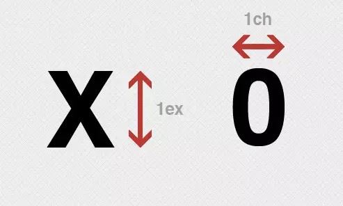
</style>ex 文档字符“x”的高度
相对于字符“x”的高度,通常为字体高度的一半,若未指定字体尺寸,则相对于浏览器的默认字体尺寸。
至于为啥是x,我TM也不知道。
<body>
    <div class="x"></div>
</body>

<style>
.x {
    height: 1ex;
    overflow: hidden;
    background: #aaa;
}
</style>
ch 文档数字“0”的的宽度
同上,相对于数字“0”的宽度。
<body>
    <h2>定义一个宽度正好能装下10个0的容器:</h2>
    <div class="0">0000000000</div>
</body>

<style>
.0 {
    width: 10ch;
    overflow: hidden;
    background: #ccc;
}
</style>
一张图解释:
vh View height / vw View Width - 可视范围
相对于可视范围的高度和宽度,可视范围被均分为 100 单位的 vh/vw;可视范围是指屏幕可见范围,不是父元素的,百分比是相对于包含它的最近的父元素的高度和宽度。
假设设备可视范围为高度 900px,宽度 750px,则,1 vh = 900px/100 = 9px,1vw = 750px/100 = 7.5px。
<body>
<h2>article title</h2>
<div class="element"></div>
<div class="full-height"></div>
</body>
<style>
.element {
width: 50vw;
height: 80vh;
/* 如果屏幕高度为1000px,则该元素高度为800px,vw 同理 */
}
.full-height {
height: 100vh;
/* 轻易实现了与屏幕同等高度的元素 */
}
h2 {
width: 100vw;
/* 设置一个和屏幕同宽的标题,标题的字体大小就会自动根据浏览器的宽度进行缩放,以达到字体和viewport大小同步的效果。 */
}
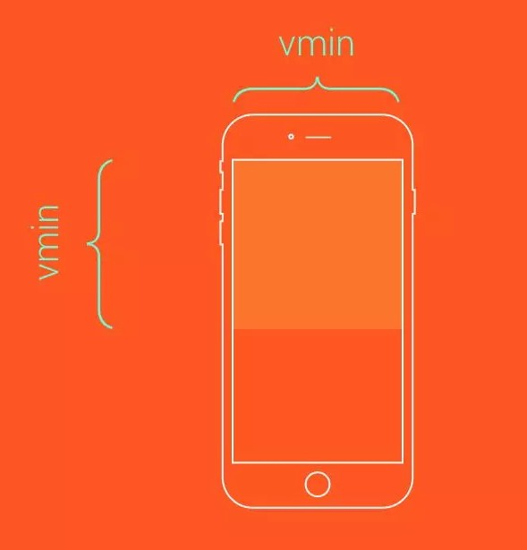
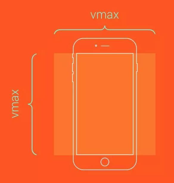
</style>vmin / vmax 可视范围的宽度或高度中较小/较大的那个尺寸
假设浏览器的宽度设置为 1200px,高度设置为 800px, 则1vmax = 1200/100px = 12px, 1vmin = 800/100px = 8px。
如果宽度设置为 600px,高度设置为 1080px, 则1vmin = 6px, 1vmax = 10.8px。
假设需要让一个元素始终在屏幕上可见:
.box {
    height: 100vmin;
    width: 100vmin;
}
假设需要让这个元素始终铺满整个视口的可见区域:
.box {
    height: 100vmax;
    width: 100vmax;
}
上述内容就是CSS中有哪些尺寸单位,你们学到知识或技能了吗?如果还想学到更多技能或者丰富自己的知识储备,欢迎关注亿速云行业资讯频道。
免责声明:本站发布的内容(图片、视频和文字)以原创、转载和分享为主,文章观点不代表本网站立场,如果涉及侵权请联系站长邮箱:is@yisu.com进行举报,并提供相关证据,一经查实,将立刻删除涉嫌侵权内容。