您好,登录后才能下订单哦!
密码登录
登录注册
点击 登录注册 即表示同意《亿速云用户服务条款》
这篇文章将为大家详细讲解有关 div+css样式如何实现带小三角的tooltips效果,小编觉得挺实用的,因此分享给大家做个参考,希望大家阅读完这篇文章后可以有所收获。
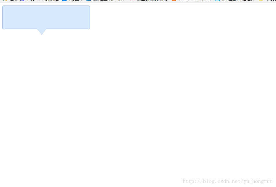
代码和效果图如下:
<!DOCTYPE html>
<html>
    <head>
        <meta charset="utf-8" />
        <title></title>
        <style type="text/css">
            .tooltips {
                position: relative;
                width: 300px;
                height: 80px;
                line-height: 60px;
                background: #D7E7FC;
                border-radius: 4px;
            }
            .arrow {
                position: absolute;
                color: #D7E7FC;
                width: 0px;
                height: 0px;
                line-height: 0px;
                border-width: 20px 15px 0;
                border-style: solid dashed dashed dashed;
                border-left-color: transparent;
                border-right-color: transparent;
                bottom: -20px;
                right: 50%;
            }
            .tooltips {
                position: relative;
                width: 300px;
                height: 80px;
                line-height: 60px;
                background: #D7E7FC;
                border: 1px solid #A5C4EC;
                border-radius: 4px;
            }
            .arrow {
                position: absolute;
                width: 0px;
                height: 0px;
                line-height: 0px;
                border-width: 20px 15px 0;
                border-style: solid dashed dashed dashed;
                border-left-color: transparent;
                border-right-color: transparent;
            }
            .arrow-border {
                color: #A5C4EC;
                bottom: -20px;
                right: 50%;
            }
            .arrow-bg {
                color: #D7E7FC;
                bottom: -19px;
                right: 50%;
            }
        </style>
    </head>
    <body>
        <!--先定义一个相对定位的盒子div:-->
        <div class="tooltips">
            <!--给div盒子添加一个三角型图标-->
            <div class="arrow "></div>
            <!--给“小三角穿上松紧带”需要使用两个三角形叠加的方式-->
            <!--首先我们定义两个三角形的div,一个背景色和盒子的边框颜色相同,一个背景色和盒子的背景色一致:-->
            <div class="arrow arrow-border"></div>
            <div class="arrow arrow-bg"></div>
            <!--注意:.arrow-bg和.arrow-border的bottom位置相差为1px(可根据边框宽度调整)两个div的顺序不可颠倒。-->
        </div>
    </body>
</html>
效果展示图
关于“ div+css样式如何实现带小三角的tooltips效果”这篇文章就分享到这里了,希望以上内容可以对大家有一定的帮助,使各位可以学到更多知识,如果觉得文章不错,请把它分享出去让更多的人看到。
免责声明:本站发布的内容(图片、视频和文字)以原创、转载和分享为主,文章观点不代表本网站立场,如果涉及侵权请联系站长邮箱:is@yisu.com进行举报,并提供相关证据,一经查实,将立刻删除涉嫌侵权内容。