您好,登录后才能下订单哦!
密码登录
登录注册
点击 登录注册 即表示同意《亿速云用户服务条款》
本篇内容主要讲解“css3怎么制作圆形按钮”,感兴趣的朋友不妨来看看。本文介绍的方法操作简单快捷,实用性强。下面就让小编来带大家学习“css3怎么制作圆形按钮”吧!
制作步骤:
一, <head>标签结构
下面代码中使用了CSS3无前缀脚本prefixfree.js,可以省去CSS3中前缀“-moz”、“-webkit”、“-o”、“-ms”
代码如下:
<head>
<meta charset="utf-8">
<title>button</title>
<script src="js/jquery.js" type="text/javascript"></script>
<script src="js/prefixfree.min.js" type="text/javascript"></script>
<link rel="stylesheet" type="text/css" href="css/button.css" />
<script type="text/javascript">
/*这里采用淡入效果试试*/
$(function(){
$(".bt").css("opacity","1");
});
</script>
</head>
二, <body>标签结构
代码如下:
<body>
<div class="bt">
<div class="button"></div>
<div class="button2"></div>
<div > </div>
</div>
</body>
三,CSS代码
代码如下:
* {
padding: 0;
margin: 0;
}
/* 清除浮动 */
.clearfix:after {
content: "";
display: table;
clear: both;
}
html, body {
height: 100%;
}
body {
font-family: "Microsoft YaHei";
background: #E1E1E1;
font-weight: 300;
font-size: 15px;
color: #333;
overflow: hidden;
}
a {
text-decoration: none;
}
/*按钮 阴影无扩展 */
.bt {
margin: 100px auto;
display: block;
width: 350px;
opacity:0;
border-bottom: 1px solid #C5C5C5;
border-top: 1px solid #C5C5C5;
box-shadow: 0 1px 0 #F6F6F6, 0 1px 0 #F6F6F6 inset;
transition: all 0.5s ease-in;
}</p>
<p>.button:before, .button2:before {
content: "";
width: 130px;
height: 130px;
display: block;
z-index: -1;
position: relative;
background: #ddd;
left: -15px;
top: -15px;
border-radius: 65px;
box-shadow: inset 2px 2px 4px rgba(0,0,0,0.4);
}
.button:after, .button2:after {
content: "注册";
color: #09F;
font-size: 20px;
width: 100%;
height: 100%;
line-height: 100px;
text-align: center;
position: absolute;
top: 0;
display: block;
}
.button2:after {
content: "登入";
word-spacing: 25px;
color: #A0D989;
}
.button, .button2 {
float: left;
margin: 50px auto;
cursor: pointer;
height: 100px;
width: 100px;
display: block;
position: relative;
color: black;
text-align: center;
line-height: 100px;
border-radius: 50px;
box-shadow: 2px 2px 4px rgba(0,0,0,0.4);
background: #FFF;
transition: all 0.5s ease-in;
}
.button {
float: left;
}
.button2 {
float: right;
}
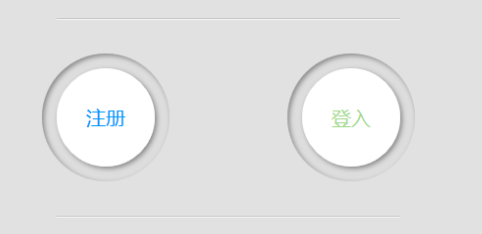
OK,制作结束。是不是简单得让人抬不起精神呢? 赶紧动手试试吧。再次申明演示地址到文章的开始处已经给出了哦,找找看啊。
下面给大家分享几个在线制作CSS3按钮的网站吧:
1,Live Tools是一个在线UI制作工具,他提供了按钮、表单、icon图标和Ribbons的制作工具,可以在线配置相关参数,生成你需要的效果代码。
2,CSS3 Button Generator是一款简单的按钮生成工具,他可以制作出两种状态下的按钮效果,当然你如果需要其他状态的下按钮效果,要在其基础上做一些参数的变化,相对来说麻烦一点。
3,Button Generator生成和图片效果一样的按钮工具。
4,Webarti CSS3 Button Maker是一款非常强大的按钮在线生成工具,他提供了很多种不同按钮效果让你参考,可以说只需选择就能制作出自己需要的按钮,思考的时间都不用你花了。
到此,相信大家对“css3怎么制作圆形按钮”有了更深的了解,不妨来实际操作一番吧!这里是亿速云网站,更多相关内容可以进入相关频道进行查询,关注我们,继续学习!
免责声明:本站发布的内容(图片、视频和文字)以原创、转载和分享为主,文章观点不代表本网站立场,如果涉及侵权请联系站长邮箱:is@yisu.com进行举报,并提供相关证据,一经查实,将立刻删除涉嫌侵权内容。