жӮЁеҘҪпјҢзҷ»еҪ•еҗҺжүҚиғҪдёӢи®ўеҚ•е“ҰпјҒ
еҜҶз Ғзҷ»еҪ•
зҷ»еҪ•жіЁеҶҢ
зӮ№еҮ» зҷ»еҪ•жіЁеҶҢ еҚіиЎЁзӨәеҗҢж„ҸгҖҠдәҝйҖҹдә‘з”ЁжҲ·жңҚеҠЎжқЎж¬ҫгҖӢ
иҝҷзҜҮж–Үз« дё»иҰҒд»Ӣз»ҚеҰӮдҪ•дҪҝз”ЁзәҜCSSз”»дёҖдёӘеңҶзҺҜпјҢж–Үдёӯд»Ӣз»Қзҡ„йқһеёёиҜҰз»ҶпјҢе…·жңүдёҖе®ҡзҡ„еҸӮиҖғд»·еҖјпјҢж„ҹе…ҙи¶Јзҡ„е°Ҹдјҷдјҙ们дёҖе®ҡиҰҒзңӢе®ҢпјҒ
з”»еңҶзҺҜжҖқжғіеҫҲз®ҖеҚ•пјҡйҰ–е…Ҳз”»дёӨдёӘеңҶпјҢи®ҫзҪ®дёҚеҗҢзҡ„иғҢжҷҜиүІпјӣ然еҗҺи®©дёӨдёӘеңҶзҡ„еңҶеҝғйҮҚеҗҲеҚіеҸҜгҖӮ
йҡҫеәҰзі»ж•°
вҳҶвҳҶ
HTML
<div class="container">
    <span class="ring-style"></span>
</div>
и§Јжһҗпјҡ
жӯӨеӨ„жңүзҲ¶е®№еҷЁ
CSS
.container {
    position: relative;
    top: 0;
    left: 0;
    width: 300px;
    height: 300px;
    background-color: lightgrey;
}
.ring-style {
    display: inline-block;
    position: absolute;
    top: 50%;
    left: 50%;
    transform: translate(-50%, -50%);
    background-color: blue;
    width: 260px;
    height: 260px;
    border-radius: 260px;
}
.ring-style::before {
    content: ' ';
    display: inline-block;
    position: absolute;
    top: 50%;
    left: 50%;
    transform: translate(-50%, -50%);
    background-color: white;
    width: 200px;
    height: 200px;
    border-radius: 200px;
}и§Јжһҗпјҡ
и®ҫзҪ®е…ғзҙ зҡ„е®Ҫй«ҳгҖҒеңҶи§’ж•ҲжһңпјҢеҚіеҸҜз”»еҮәдёҖдёӘеңҶ
йҖҡиҝҮ ::before дјӘе…ғзҙ е’Ңжң¬дҪ“е…ғзҙ пјҢеҲӣе»әдёӨдёӘеңҶ
йҖҡиҝҮеҹәдәҺзҲ¶е®№еҷЁзҡ„з»қеҜ№е®ҡдҪҚпјҢи®ҫзҪ® topгҖҒleftгҖҒtranslate еұһжҖ§пјҢи®©е…ғзҙ еҹәдәҺзҲ¶е®№еҷЁж°ҙе№ігҖҒз«–зӣҙеұ…дёӯпјҢеҚіеҸҜи®©дёӨдёӘеңҶзҡ„еңҶеҝғйҮҚеҗҲ
гҖҗ гҖ‘
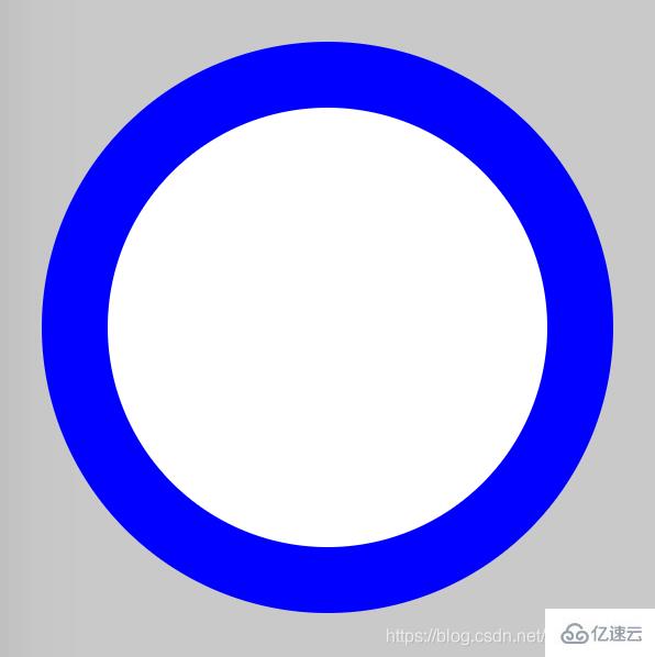
ж•Ҳжһңеӣҫ
зҹҘиҜҶзӮ№
border-radius
::before && ::after
е…ғзҙ ж°ҙе№ігҖҒз«–зӣҙеұ…дёӯ
д»ҘдёҠжҳҜвҖңеҰӮдҪ•дҪҝз”ЁзәҜCSSз”»дёҖдёӘеңҶзҺҜвҖқиҝҷзҜҮж–Үз« зҡ„жүҖжңүеҶ…е®№пјҢж„ҹи°ўеҗ„дҪҚзҡ„йҳ…иҜ»пјҒеёҢжңӣеҲҶдә«зҡ„еҶ…е®№еҜ№еӨ§е®¶жңүеё®еҠ©пјҢжӣҙеӨҡзӣёе…ізҹҘиҜҶпјҢж¬ўиҝҺе…іжіЁдәҝйҖҹдә‘иЎҢдёҡиө„и®Ҝйў‘йҒ“пјҒ
е…ҚиҙЈеЈ°жҳҺпјҡжң¬з«ҷеҸ‘еёғзҡ„еҶ…е®№пјҲеӣҫзүҮгҖҒи§Ҷйў‘е’Ңж–Үеӯ—пјүд»ҘеҺҹеҲӣгҖҒиҪ¬иҪҪе’ҢеҲҶдә«дёәдё»пјҢж–Үз« и§ӮзӮ№дёҚд»ЈиЎЁжң¬зҪ‘з«ҷз«ӢеңәпјҢеҰӮжһңж¶үеҸҠдҫөжқғиҜ·иҒ”зі»з«ҷй•ҝйӮ®з®ұпјҡis@yisu.comиҝӣиЎҢдёҫжҠҘпјҢ并жҸҗдҫӣзӣёе…іиҜҒжҚ®пјҢдёҖз»ҸжҹҘе®һпјҢе°Ҷз«ӢеҲ»еҲ йҷӨж¶үе«ҢдҫөжқғеҶ…е®№гҖӮ
жӮЁеҘҪпјҢзҷ»еҪ•еҗҺжүҚиғҪдёӢи®ўеҚ•е“ҰпјҒ