жӮЁеҘҪпјҢзҷ»еҪ•еҗҺжүҚиғҪдёӢи®ўеҚ•е“ҰпјҒ
еҜҶз Ғзҷ»еҪ•
зҷ»еҪ•жіЁеҶҢ
зӮ№еҮ» зҷ»еҪ•жіЁеҶҢ еҚіиЎЁзӨәеҗҢж„ҸгҖҠдәҝйҖҹдә‘з”ЁжҲ·жңҚеҠЎжқЎж¬ҫгҖӢ
PythonдёӯжҖҺд№ҲдҪҝз”Ёmatplotlibе®һзҺ°ж•°жҚ®еҸҜи§ҶеҢ–пјҢзӣёдҝЎеҫҲеӨҡжІЎжңүз»ҸйӘҢзҡ„дәәеҜ№жӯӨжқҹжүӢж— зӯ–пјҢдёәжӯӨжң¬ж–ҮжҖ»з»“дәҶй—®йўҳеҮәзҺ°зҡ„еҺҹеӣ е’Ңи§ЈеҶіж–№жі•пјҢйҖҡиҝҮиҝҷзҜҮж–Үз« еёҢжңӣдҪ иғҪи§ЈеҶіиҝҷдёӘй—®йўҳгҖӮ
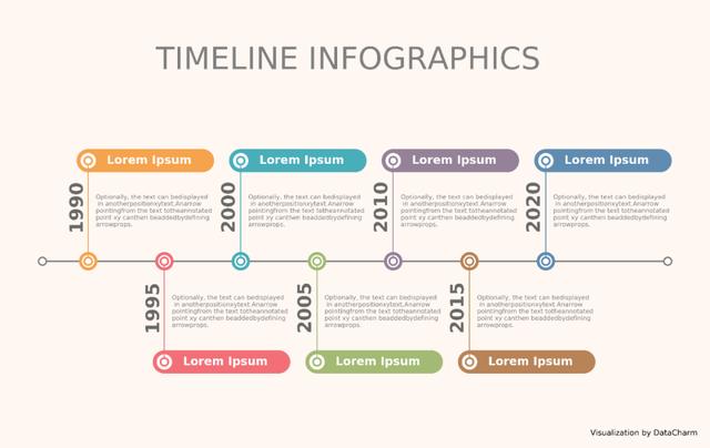
жң¬жңҹжҲ‘们жһ„е»әдёҖз»„з®ҖеҚ•зҡ„ж—¶й—ҙеҸҳеҢ–еӣҫиЎЁж•°жҚ®пјҢеҪ“然иҝҳжңүжҲ‘们常用зҡ„йўңиүІеӯ—е…ёжһ„е»әгҖӮе…·дҪ“еҰӮдёӢпјҡ
import pandas as pd
import numpy as np
import matplotlib.pyplot as plt

test_dict = {'x':[0,5,10,15,20,25,30],'year':['1990','1995','2000','2005','2010','2015','2020']}
artist_04 = pd.DataFrame(test_dict)

color = ("#F5A34D", "#F26F77", "#48AEBA", "#A3BA74","#958298", "#B88357",'#608CB1' )
data = artist_04['x'].to_list()
data_color = dict(zip(data,color))
data_colorйўңиүІеӯ—е…ёеҰӮдёӢпјҡ
{0: '#F5A34D',
 5: '#F26F77',
 10: '#48AEBA',
 15: '#A3BA74',
 20: '#958298',
 25: '#B88357',
30: '#608CB1'}иҜҰз»Ҷз»ҳеӣҫд»Јз ҒеҰӮдёӢпјҡ
fig,ax = plt.subplots(figsize=(8,4),dpi=200,facecolor='#FFF7F2',edgecolor='#FFF7F2')
ax.set_facecolor('#FFF7F2')
#з»ҳеҲ¶дёӯй—ҙжЁӘзәҝ
ax.set_ylim(-.5,1.5)
#з»ҳеҲ¶е…·жңүз«ҜзӮ№еҪўзҠ¶зҡ„зӣҙзәҝ
ax.plot([-3,38],[.5,.5],"-o",lw=1.2,color='gray',markerfacecolor="w",mec='gray',ms=5,
markeredgewidth=1.,zorder=1)
#еҲҶдёҠдёӢжғ…еҶөз»ҳеҲ¶зӮ№гҖҒзәҝж··еҗҲеӣҫеҪў
for x in [0,10,20,30]:
#з»ҳеҲ¶жЁӘзәҝдёҠзҡ„ж•ЈзӮ№пјҢйўңиүІдёҚеҗҢ
ax.scatter(x,.5,s=120,color=data_color[x],zorder=2)
#з»ҳеҲ¶еҸ еҠ еңЁйўңиүІж•ЈзӮ№д№ӢдёҠзҡ„ж•ЈзӮ№пјҢйўңиүІдёәзҷҪиүІ
ax.scatter(x,.5,s=50,zorder=3,color='white')
#з»ҳеҲ¶ж•ЈзӮ№е’ҢеңҶжҹұд№Ӣй—ҙзҡ„иҝһжҺҘзәҝпјҢз«ҜзӮ№дёәеңҶзӮ№
ax.plot([x,x],[.5,.5+.6],"-o",color=data_color[x],lw=.6,mfc="w",ms=5,mew=1.2,zorder=3)
#з»ҳеҲ¶жЁӘзҪ®еңҶжҹұеӣҫ
ax.plot([x,x+7.5],[.5+.6,.5+.6],lw=15,color=data_color[x],solid_capstyle='round',zorder=1)
ax.scatter(x,.5+.6,s=80,zorder=3,color='white')
ax.text(x+4,.5+.6,s='Lorem Ipsum',color='white',fontsize=7.5,fontweight='semibold',ha='center',
va='center')
#ж·»еҠ е№ҙд»Ҫ
ax.text(x-1.4,.5+.2,s=artist_04.loc[artist_04['x']==x,'year'].values[0],color='#686866',fontsize=12,
fontweight='bold',rotation=90)
#ж·»еҠ жҸҸиҝ°ж–Үеӯ—
ax.text(x+.5,.5+.3,'Optionally, the text can bedisplayed\n in anotherpositionxytext.Anarrow\npointingfrom the text totheannotated\npoint xy canthen beaddedbydefining\narrowprops.',
ha='left', va='center',fontsize = 4,color='gray')
for x in [5,15,25]:
#з»ҳеҲ¶жЁӘзәҝдёҠзҡ„ж•ЈзӮ№пјҢйўңиүІдёҚеҗҢ
ax.scatter(x,.5,s=120,color=data_color[x],zorder=2)
#з»ҳеҲ¶еҸ еҠ еңЁйўңиүІж•ЈзӮ№д№ӢдёҠзҡ„ж•ЈзӮ№пјҢйўңиүІдёәзҷҪиүІ
ax.scatter(x,.5,s=50,zorder=3,color='white')
#з»ҳеҲ¶ж•ЈзӮ№е’ҢеңҶжҹұд№Ӣй—ҙзҡ„иҝһжҺҘзәҝпјҢз«ҜзӮ№дёәеңҶзӮ№
ax.plot([x,x],[.5,.5-.6],"-o",color=data_color[x],lw=.6,mfc="w",ms=5,mew=1.2,zorder=3)
#з»ҳеҲ¶жЁӘзҪ®еңҶжҹұеӣҫ
ax.plot([x,x+7.5],[.5-.6,.5-.6],lw=15,color=data_color[x],solid_capstyle='round',zorder=1)
ax.scatter(x,.5-.6,s=80,zorder=3,color='white')
ax.text(x+4,.5-.6,s='Lorem Ipsum',color='white',fontsize=7.5,fontweight='semibold',ha='center',
va='center')
#ж·»еҠ жҸҸиҝ°ж–Үеӯ—
ax.text(x+.5,.5-.3,'Optionally, the text can bedisplayed\n in anotherpositionxytext.Anarrow\npointingfrom the text totheannotated\npoint xy canthen beaddedbydefining\narrowprops.',
ha='left', va='center',fontsize = 4,color='gray')
#ж·»еҠ е№ҙд»Ҫ
ax.text(x-1.4,.5-.4,s=artist_04.loc[artist_04['x']==x,'year'].values[0],color='#686866',fontsize=12,
fontweight='bold',rotation=90)
#ж·»еҠ йўҳзӣ®ж–Үжң¬
ax.axis('off')
ax.text(.49,1.15,'\nTIMELINE INFOGRAPHICS',transform = ax.transAxes,
ha='center', va='center',fontsize = 20,color='gray',fontweight='light')
ax.text(.92,.00,'\nVisualization by DataCharm',transform = ax.transAxes,
ha='center', va='center',fontsize = 5,color='black')
plt.savefig(r'F:\DataCharm\е•ҶдёҡиүәжңҜеӣҫиЎЁд»ҝеҲ¶\artist_04.png',width=8,height=4,
dpi=900,bbox_inches='tight',facecolor='#FFF7F2')зҹҘиҜҶзӮ№пјҡ
пјҲ1пјүзҶҹжӮүax.plot()еҮҪж•°ж–№жі•пјҢе…¶д»–еҸӮж•°и®ҫзҪ®дёҚеҗҢеҜ№з»“жһңд№ҹдёҚеҗҢгҖӮ
пјҲ2пјүax.scatter()з»ҳеҲ¶ж•ЈзӮ№гҖӮ
пјҲ3пјүax.text()ж–Үжң¬зҡ„зҒөжҙ»ж·»еҠ гҖӮ
пјҲ4пјүйўңиүІзҡ„еҗҲзҗҶйҖүжӢ©гҖӮ
з»“жһңеӣҫиЎЁеҰӮдёӢпјҡ
зңӢе®ҢдёҠиҝ°еҶ…е®№пјҢдҪ 们жҺҢжҸЎPythonдёӯжҖҺд№ҲдҪҝз”Ёmatplotlibе®һзҺ°ж•°жҚ®еҸҜи§ҶеҢ–зҡ„ж–№жі•дәҶеҗ—пјҹеҰӮжһңиҝҳжғіеӯҰеҲ°жӣҙеӨҡжҠҖиғҪжҲ–жғідәҶи§ЈжӣҙеӨҡзӣёе…іеҶ…е®№пјҢж¬ўиҝҺе…іжіЁдәҝйҖҹдә‘иЎҢдёҡиө„и®Ҝйў‘йҒ“пјҢж„ҹи°ўеҗ„дҪҚзҡ„йҳ…иҜ»пјҒ
е…ҚиҙЈеЈ°жҳҺпјҡжң¬з«ҷеҸ‘еёғзҡ„еҶ…е®№пјҲеӣҫзүҮгҖҒи§Ҷйў‘е’Ңж–Үеӯ—пјүд»ҘеҺҹеҲӣгҖҒиҪ¬иҪҪе’ҢеҲҶдә«дёәдё»пјҢж–Үз« и§ӮзӮ№дёҚд»ЈиЎЁжң¬зҪ‘з«ҷз«ӢеңәпјҢеҰӮжһңж¶үеҸҠдҫөжқғиҜ·иҒ”зі»з«ҷй•ҝйӮ®з®ұпјҡis@yisu.comиҝӣиЎҢдёҫжҠҘпјҢ并жҸҗдҫӣзӣёе…іиҜҒжҚ®пјҢдёҖз»ҸжҹҘе®һпјҢе°Ҷз«ӢеҲ»еҲ йҷӨж¶үе«ҢдҫөжқғеҶ…е®№гҖӮ
жӮЁеҘҪпјҢзҷ»еҪ•еҗҺжүҚиғҪдёӢи®ўеҚ•е“ҰпјҒ