您好,登录后才能下订单哦!
密码登录
登录注册
点击 登录注册 即表示同意《亿速云用户服务条款》
这篇文章将为大家详细讲解有关Python Matplotlib如何绘制多子图,小编觉得挺实用的,因此分享给大家做个参考,希望大家阅读完这篇文章后可以有所收获。
通过获取子图的label和线型来合并图例
注意添加label
#导入数据(读者可忽略)
pre_lp=total_res#组合模型
true=diff1[-pre_day:]#真实值
pre_ph=results_data["yhat"]#prophet
pre_lstm=reslut#lstm
pre_ari=data_ari['data_pre']#arima
#设置中文字体
rcParams['font.sans-serif'] = 'kaiti'
# 生成一个时间序列 (读者可根据情况进行修改或删除)
time =pd.to_datetime(np.arange(0,21), unit='D',
origin=pd.Timestamp('2021-10-19'))
#创建画布
fig=plt.figure(figsize=(20,16))#figsize为画布大小
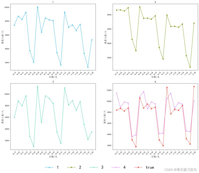
# 1
ax1=fig.add_subplot(221)
ax1.plot(time,pre_lp,color='#1bb9f6',marker='^',linestyle='-',label='1')
# ax1.plot(time,true,color='#fd5749',marker='s',linestyle='-',label='true')
ax1.set_title('1',fontsize=15)#设置标题
ax1.set_xlabel('日期/天',fontsize=15)#设置横坐标名称
ax1.set_ylabel('感染人数/人',fontsize=15)#设置纵坐标名称
ax1.xaxis.set_major_formatter(mdate.DateFormatter('%m-%d'))#设置横坐标刻度(读者可忽略)
plt.xticks(pd.date_range(time[0],time[-1],freq='D'),rotation=45)#设置横坐标刻度(读者可忽略)
# 2
ax2=fig.add_subplot(222)
ax2.plot(time,pre_ph,color='#739b06',marker='o',linestyle='-',label='2')
# ax2.plot(time,true,color='#fd5749',marker='s',linestyle='-',label='true')
ax2.set_title('2',fontsize=15)
ax2.set_xlabel('日期/天',fontsize=15)
ax2.set_ylabel('感染人数/人',fontsize=15)
ax2.xaxis.set_major_formatter(mdate.DateFormatter('%m-%d'))
plt.xticks(pd.date_range(time[0],time[-1],freq='D'),rotation=45)
# 3
ax3=fig.add_subplot(223)
ax3.plot(time,pre_lstm,color='#38d9a9',marker='*',linestyle='-',label='3')
# ax3.plot(time,true,color='#fd5749',marker='s',linestyle='-',label='true')
ax3.set_title('3',fontsize=15)
ax3.set_xlabel('日期/天',fontsize=15)
ax3.set_ylabel('感染人数/人',fontsize=15)
ax3.xaxis.set_major_formatter(mdate.DateFormatter('%m-%d'))
plt.xticks(pd.date_range(time[0],time[-1],freq='D'),rotation=45)
# 4
ax4=fig.add_subplot(224)
ax4.plot(time,pre_ari,color='#e666ff',marker='x',linestyle='-',label='4')
ax4.plot(time,true,color='#fd5749',marker='s',linestyle='-',label='true')
ax4.set_title('4',fontsize=15)
ax4.set_xlabel('日期/天',fontsize=15)
ax4.set_ylabel('感染人数/人',fontsize=15)
ax4.xaxis.set_major_formatter(mdate.DateFormatter('%m-%d'))
plt.xticks(pd.date_range(time[0],time[-1],freq='D'),rotation=45)
#初始化labels和线型数组
lines=[]
labels=[]
#通过循环获取线型和labels
for ax in fig.axes:
axLine, axLabel = ax.get_legend_handles_labels()
lines.extend(axLine)
labels.extend(axLabel)
#设置图例和调整图例位置
fig.legend(lines, labels,loc='lower center',
ncol=5,framealpha=False,fontsize=25)结果如下图
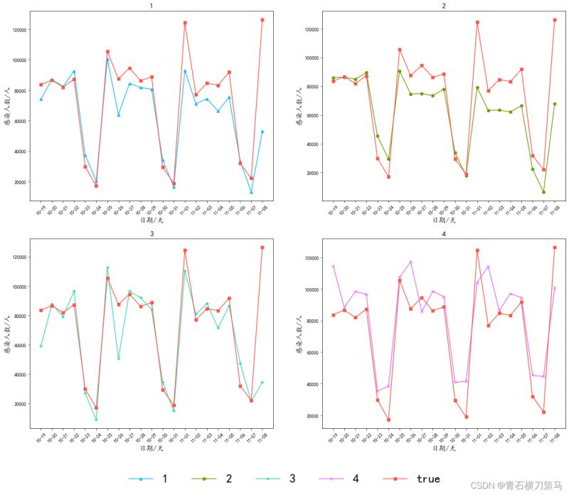
这个时候我们再把原先代码里面的通过循环获取label和线型注释掉,代码如下
#导入数据(读者可忽略)
pre_lp=total_res#组合模型
true=diff1[-pre_day:]#真实值
pre_ph=results_data["yhat"]#prophet
pre_lstm=reslut#lstm
pre_ari=data_ari['data_pre']#arima
#设置中文字体
rcParams['font.sans-serif'] = 'kaiti'

# 生成一个时间序列 (读者可根据情况进行修改或删除)
time =pd.to_datetime(np.arange(0,21), unit='D',
                    origin=pd.Timestamp('2021-10-19'))
#创建画布
fig=plt.figure(figsize=(20,16))#figsize为画布大小
# 1
ax1=fig.add_subplot(221)
ax1.plot(time,pre_lp,color='#1bb9f6',marker='^',linestyle='-',label='1')
ax1.plot(time,true,color='#fd5749',marker='s',linestyle='-',label='true')
ax1.set_title('1',fontsize=15)#设置标题
ax1.set_xlabel('日期/天',fontsize=15)#设置横坐标名称
ax1.set_ylabel('感染人数/人',fontsize=15)#设置纵坐标名称
ax1.xaxis.set_major_formatter(mdate.DateFormatter('%m-%d'))#设置横坐标刻度(读者可忽略)
plt.xticks(pd.date_range(time[0],time[-1],freq='D'),rotation=45)#设置横坐标刻度(读者可忽略)

# 2
ax2=fig.add_subplot(222)
ax2.plot(time,pre_ph,color='#739b06',marker='o',linestyle='-',label='2')
ax2.plot(time,true,color='#fd5749',marker='s',linestyle='-',label='true')
ax2.set_title('2',fontsize=15)
ax2.set_xlabel('日期/天',fontsize=15)
ax2.set_ylabel('感染人数/人',fontsize=15)
ax2.xaxis.set_major_formatter(mdate.DateFormatter('%m-%d'))
plt.xticks(pd.date_range(time[0],time[-1],freq='D'),rotation=45)
# 3
ax3=fig.add_subplot(223)
ax3.plot(time,pre_lstm,color='#38d9a9',marker='*',linestyle='-',label='3')
ax3.plot(time,true,color='#fd5749',marker='s',linestyle='-',label='true')
ax3.set_title('3',fontsize=15)
ax3.set_xlabel('日期/天',fontsize=15)
ax3.set_ylabel('感染人数/人',fontsize=15)
ax3.xaxis.set_major_formatter(mdate.DateFormatter('%m-%d'))
plt.xticks(pd.date_range(time[0],time[-1],freq='D'),rotation=45)

# 4
ax4=fig.add_subplot(224)
ax4.plot(time,pre_ari,color='#e666ff',marker='x',linestyle='-',label='4')
ax4.plot(time,true,color='#fd5749',marker='s',linestyle='-',label='true')
ax4.set_title('4',fontsize=15)
ax4.set_xlabel('日期/天',fontsize=15)
ax4.set_ylabel('感染人数/人',fontsize=15)
ax4.xaxis.set_major_formatter(mdate.DateFormatter('%m-%d'))
plt.xticks(pd.date_range(time[0],time[-1],freq='D'),rotation=45)

#初始化labels和线型数组
# lines=[]
# labels=[]
#通过循环获取线型和labels
# for ax in fig.axes:
#  	 axLine, axLabel = ax.get_legend_handles_labels()
#    lines.extend(axLine)
#    labels.extend(axLabel)
#设置图例和调整图例位置
fig.legend(lines, labels,loc='lower center',
           ncol=5,framealpha=False,fontsize=25)
结果如下图
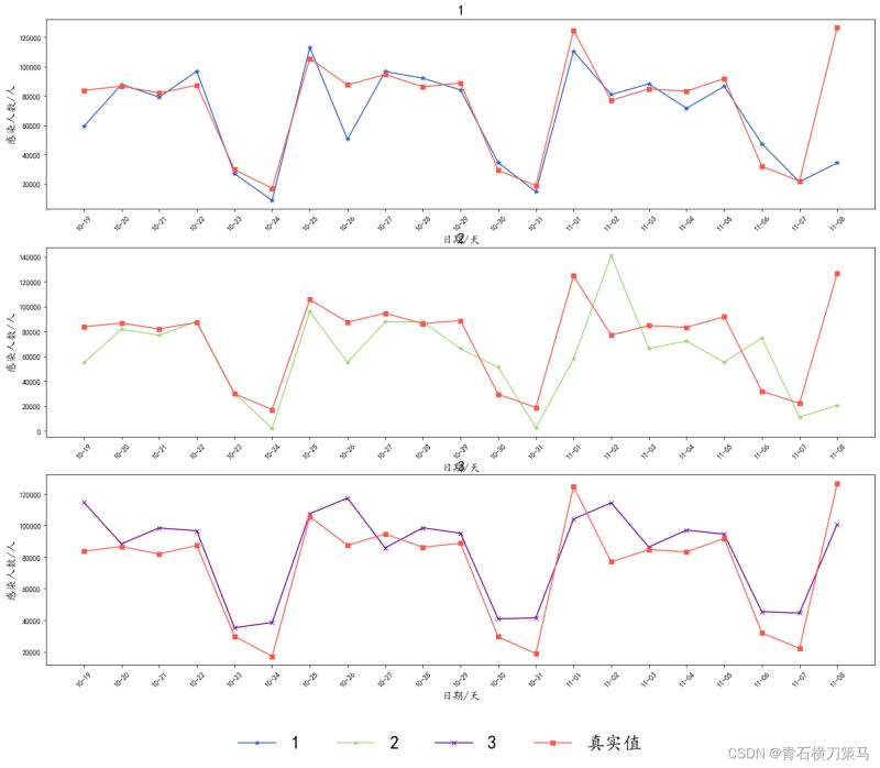
调整子图间距
plt.subplots_adjust(wspace=0.4,hspace=0.4)
wspace为子图之间宽间距,hspace为子图之间高间距
对比图如下
设置了间距的图像
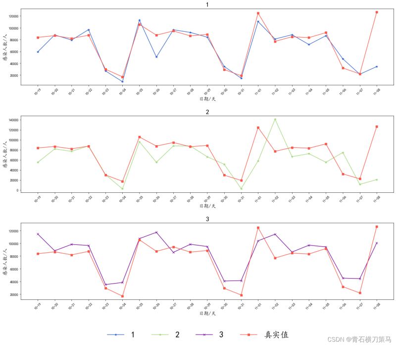
没有设置间距的图像
关于“Python Matplotlib如何绘制多子图”这篇文章就分享到这里了,希望以上内容可以对大家有一定的帮助,使各位可以学到更多知识,如果觉得文章不错,请把它分享出去让更多的人看到。
免责声明:本站发布的内容(图片、视频和文字)以原创、转载和分享为主,文章观点不代表本网站立场,如果涉及侵权请联系站长邮箱:is@yisu.com进行举报,并提供相关证据,一经查实,将立刻删除涉嫌侵权内容。