您好,登录后才能下订单哦!
密码登录
登录注册
点击 登录注册 即表示同意《亿速云用户服务条款》
本篇内容主要讲解“JavaScript圣杯布局与双飞翼布局如何实现”,感兴趣的朋友不妨来看看。本文介绍的方法操作简单快捷,实用性强。下面就让小编来带大家学习“JavaScript圣杯布局与双飞翼布局如何实现”吧!
圣杯布局和双飞翼布局是三栏布局中的两种布局方式,他们实现的效果是相同的,区别就是实现方法。
header和footer各自占领屏幕所有宽度,高度固定;
中间的outer是一个三栏布局;
三栏布局中left和right不变,center填充其他地方;
中间部分的高度是三栏中最高的区域的高度。
其实这个并不是圣杯布局中的要求,圣杯布局是可以指定高度的,但是可以作为一个思考;
方法就是使用flex布局,将主轴设置为纵轴,再将outer的flex设为1,意思就是填充多余空白,即可达到自适应屏幕高度的效果。
body{
    display: flex;
    width: 100%;
    height: 100%;
    flex-direction: column;
}
.header{
    background-color:grey;
    height: 50px;
}
.footer{
    background-color:grey;
    height: 50px;
}
.outer{
    flex:1;
}将center盒子写在最前面,保证center盒子最先渲染;
给outer盒子指定padding-left 和 padding-right值,留出left和right的位置;
三个盒子都设置float:left,这时left和right就会被挤到下一行;
left设置margin-left:-100%;相对定位+left:-left的宽度;right设置margin-left=-right的宽度;相对定位+right:-right的宽度即可将两个盒子归位。
<style>
  * {
      padding: 0;
      margin: 0;
      text-align: center;
  }
  html{
      height: 100%;
  }
  body{
      display: flex;
      flex-direction: column;
      height: 100%;;
  }
  .header{
      width: 100%;
      height: 50px;
      background-color:dimgray;
  }
  .footer{
      width: 100%;
      height: 50px;
      background-color:dimgray;
  }
  .outer{
      flex:1;
      padding-left: 100px;
      padding-right: 200px;
  }
  .center{
      float: left;
      background-color: darkslateblue;
      height: 100%;
      width: 100%;
  }
  .left{
      float: left;
      width: 100px;
      margin-left: -100%;
      background-color: burlywood;
      height: 100%;
      position: relative;
      left: -100px;
  }
  .right{
      float: left;
      width: 200px;
      margin-left: -200px;
      height: 100%;
      position: relative;
      right: -200px;
      background-color: cyan;
  }
</style>
<body>
    <div class="header">header</div>
    <div class="outer">
        <div class="center">center</div>
        <div class="left">left</div>
        <div class="right">right</div>
    </div>
    <div class="footer">footer</div>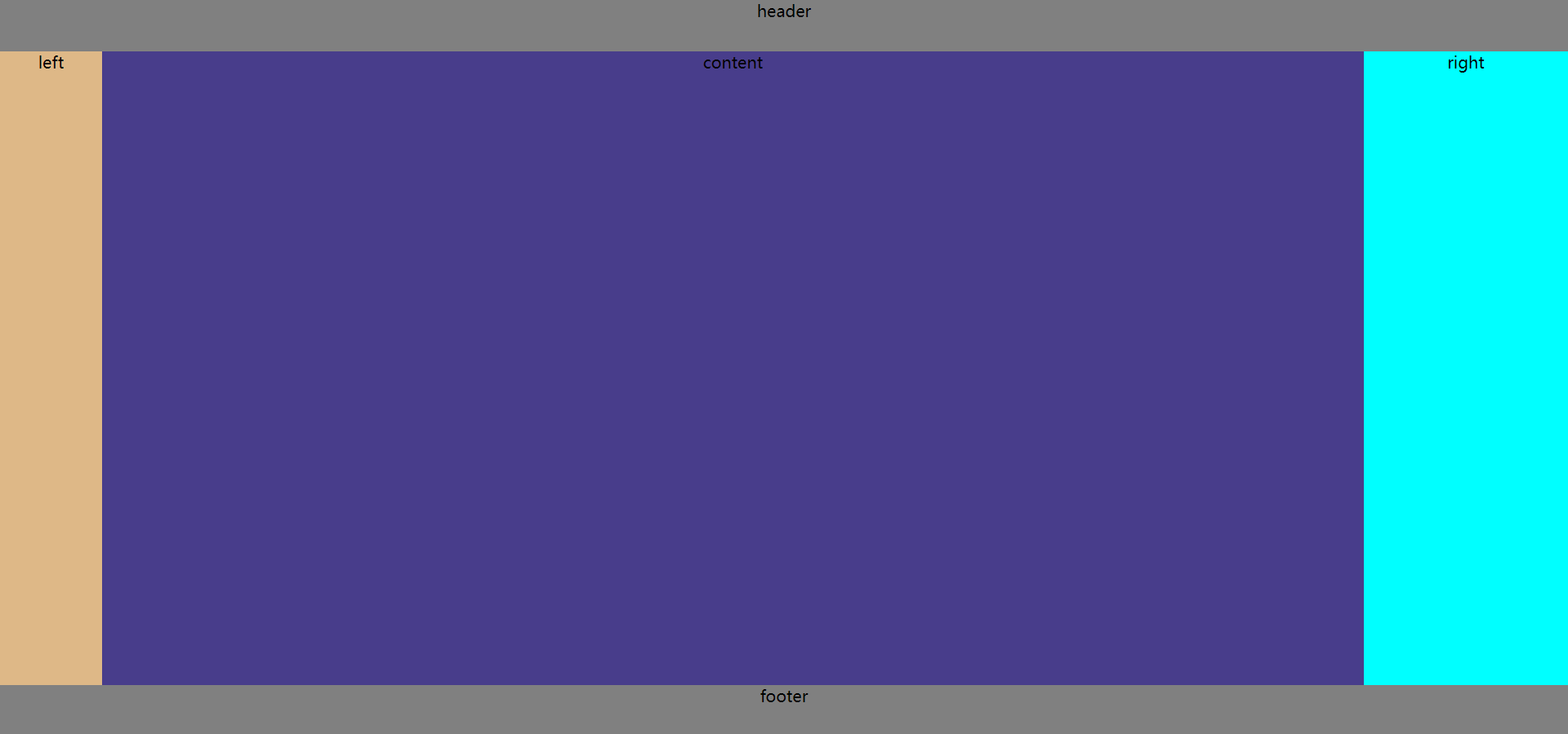
</body>给三个盒子都设置为左浮动;
center的宽度设为100%;
left设置margin-left:-100%;right设置margin-left=-right的宽度即可将两个盒子归位,但是将center的两端挡住了;
在center盒子中再写一个content盒子,设置margin-left和margin-right为两侧的宽度,content盒子作为内容。
<style>
    *{
        padding: 0;
        margin: 0;
    }
    html{
        width: 100%;
        height: 100%;
        text-align: center;
    }
    body{
        display: flex;
        width: 100%;
        height: 100%;
        flex-direction: column;
    }
    .header{
        background-color:grey;
        height: 50px;
    }
    .footer{
        background-color:grey;
        height: 50px;
    }
    .outer{
        flex:1;
    }
    .center{
        float: left;
        width: 100%;
        background-color: darkslateblue;
        height: 100%;
    }
    .left{
        float: left;
        margin-left: -100%;
        width: 100px;
        background-color: burlywood;
        height: 100%;
    }
    .right{
        float: left;
        width: 200px;
        background-color: cyan;
        margin-left: -200px;
        height: 100%;
    }
    .content{
        margin-left: 100px;
        margin-right: 200px;
        height: 100%;
    }
</style>
<body>
    <div class="header">header</div>
    <div class="outer">
        <div class="center">
            <div class="content">content</div>
        </div>
        <div class="left">left</div>
        <div class="right">right</div>
    </div>
    <div class="footer">footer</div>
</body>圣杯布局是利用padding将中间部分留出,再利用定位、margin的方式将左右盒子归位,因此不需要外层div;
双飞翼布局是先设置中间盒子的宽度为100%,再用margin移动左右盒子覆盖了中间盒子的两侧,再将outer中间加入一个盒子,留出两侧的margin值,达到三栏布局的效果。
回答:圣杯布局和双飞翼布局都可以实现三栏布局,即两侧宽度固定,中间自适应的效果。圣杯布局是先用padding将中间内容留出,再定位左右盒子到相应位置;而双飞翼布局首先将中间盒子的宽度设为了100%,在定位左右盒子的时候会覆盖中间盒子的两端,这样就需要在中间盒子中在定义一个盒子,并留出margin的两侧值。两种布局都需要把center盒子写在left和right前面,为了最先渲染。
到此,相信大家对“JavaScript圣杯布局与双飞翼布局如何实现”有了更深的了解,不妨来实际操作一番吧!这里是亿速云网站,更多相关内容可以进入相关频道进行查询,关注我们,继续学习!
免责声明:本站发布的内容(图片、视频和文字)以原创、转载和分享为主,文章观点不代表本网站立场,如果涉及侵权请联系站长邮箱:is@yisu.com进行举报,并提供相关证据,一经查实,将立刻删除涉嫌侵权内容。