您好,登录后才能下订单哦!
密码登录
登录注册
点击 登录注册 即表示同意《亿速云用户服务条款》
本篇内容主要讲解“怎么用纯css绘制各种图形”,感兴趣的朋友不妨来看看。本文介绍的方法操作简单快捷,实用性强。下面就让小编来带大家学习“怎么用纯css绘制各种图形”吧!
1、 向上三角形
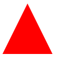
CSS核心代码
.triangle-up {
width: 0;
border-left: 50px solid transparent;
border-right: 50px solid transparent;
border-bottom: 100px solid red;
}
2、 左上三角形
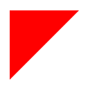
CSS核心代码
.triangle-topleft {
width: 0;
border-top: 100px solid red;
border-right: 100px solid transparent;
}
3、 弧形尾箭头
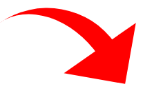
CSS核心代码
.curvedarrow {
position: relative;
width: 0;
border-top: 90px solid transparent;
border-right: 90px solid red;
transform: rotate(10deg) translateX(100%);
}
.curvedarrow:after {
content: "";
position: absolute;
border: 0 solid transparent;
border-top: 30px solid red;
border-radius: 200px 0 0 0;
top: -120px; left: -90px;
width: 120px; height: 120px;
transform: rotate(45deg);
}
4、 吃豆人
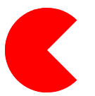
CSS核心代码:
.pacman {
width: 0px; height: 0px;
border-right: 60px solid transparent;
border-top: 60px solid red;
border-left: 60px solid red;
border-bottom: 60px solid red;
border-top-left-radius: 60px;
border-top-right-radius: 60px;
border-bottom-left-radius: 60px;
border-bottom-right-radius: 60px;
}
5、 带尖角的说话泡泡
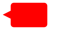
CSS核心代码:
.talkbubble {
width: 120px; height: 80px;
background: red;
position: relative;
border-radius: 10px;
}
.talkbubble:before {
content: "";
position: absolute;
right: 100%; top: 26px;
border-top: 13px solid transparent;
border-right: 26px solid red;
border-bottom: 13px solid transparent;
}
6、bilibili电视机
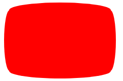
CSS核心代码
.tv {
position: relative;
width: 200px; height: 150px;
margin: 20px 0;
background: red;
border-radius: 50% / 10%;
color: white;
text-align: center;
text-indent: .1em;
}
.tv:before {
content: '';
position: absolute;
top: 10%; bottom: 10%; right: -5%; left: -5%;
background: inherit;
border-radius: 5% / 50%;
}
7、放大镜
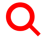
.magnifying-glass {
font-size: 10em;
display: inline-block;
width: 0.4em; height: 0.4em;
border: 0.1em solid red;
position: relative;
border-radius: 0.35em;
}
.magnifying-glass:before {
content: "";
display: inline-block;
position: absolute;
right: -0.25em; bottom: -0.1em;
border-width: 0;
background: red;
width: 0.35em; height: 0.08em;
transform: rotate(45deg);
}
8、长长的指向图形

CSS核心代码:
.pointer {
width: 200px; height: 40px;
position: relative;
background: red;
}
.pointer:after {
content: "";
position: absolute;
left: 0; bottom: 0;
border-left: 20px solid white;
border-top: 20px solid transparent;
border-bottom: 20px solid transparent;
}
.pointer:before {
content: "";
position: absolute;
right: -20px; bottom: 0;
border-left: 20px solid red;
border-top: 20px solid transparent;
border-bottom: 20px solid transparent;
}
最后还是要跟小伙伴们强调一下,由于部分图形效果使用了CSS3的部分属性,如果你还在使用IE的话,我建议你使用现代浏览器,比如:Mozilla Firefox、Google Chrome、Safari、Opera。上面展示的效果可能部分实用性不大,但是使用css制作三角和圆有效果应用还是很多了,特别是用来制作tips效果。
到此,相信大家对“怎么用纯css绘制各种图形”有了更深的了解,不妨来实际操作一番吧!这里是亿速云网站,更多相关内容可以进入相关频道进行查询,关注我们,继续学习!
免责声明:本站发布的内容(图片、视频和文字)以原创、转载和分享为主,文章观点不代表本网站立场,如果涉及侵权请联系站长邮箱:is@yisu.com进行举报,并提供相关证据,一经查实,将立刻删除涉嫌侵权内容。