您好,登录后才能下订单哦!
密码登录
登录注册
点击 登录注册 即表示同意《亿速云用户服务条款》
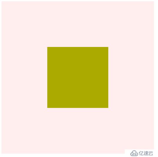
第一种方法:用margin+绝对定位的方式
兼容性:IE6,IE7下完全失效
HTML代码:
<div id="container">
		<div class="center"></div>
  </div>
CSS代码:
#container{
	  /*基本样式*/
	  width:500px;
	  height:500px;
	  background:#fee;
	  /*定位方式*/
	  position:relative;
	}
	 .center{
	  /*基本样式*/
	  width:200px;
	  height:200px;
	  background:#aa0;
	  /*水平居中*/
	  margin:auto;
	  /*垂直居中*/
	  position:absolute;
	  top:0;
	  bottom:0;
	  left:0;
	  right:0;
	}
效果:
第二种方法:用inline-block和table-cell
兼容性:IE6,IE7下垂直居中失效
CSS代码:
#container{
	  /*基本样式*/
	  width:500px;
	  height:500px;
	  background:#fee;
	  /*display*/
	  display:table-cell;
	  text-align:center;
	  vertical-align:middle;
	}
	 .center{
	  /*基本样式*/
	  width:200px;
	  height:200px;
	  background:#aa0;
	  /*display:通过转为行内块配合父级元素使用text-align实现水平居中*/
	 display:inline-block;
	}
第三种方法:用纯position
兼容性:所有浏览器都支持,包括老IE。缺陷:必须明确宽高的固定值
CSS代码:
#container{
	  /*基本样式*/
	  width:500px;
	  height:500px;
	  background:#fee;
	  /*定位方式*/
	  position:relative;
	}
	 .center{
	  /*基本样式*/
	  width:200px;
	  height:200px;
	  background:#aa0;
	  /*定位方式*/
	  position:absolute;
	  top:150px; /*(父元素的宽高-子元素的宽高)/2*/
	  left:150px;
	}
第四种方法:用position和transform
兼容性:一看到CSS3属性就知道了IE8及以下浏览器都不支持,个人认为这种方法有些鸡肋
CSS代码:
#container{
	  /*基本样式*/
	  width:500px;
	  height:500px;
	  background:#fee;
	  /*定位方式*/
	  position:relative;
	}
	 .center{
	  /*基本样式*/
	  width:200px;
	  height:200px;
	  background:#aa0;
	  /*定位方式*/
	  position:absolute;
	  top:50%;
	  left:50%;
	  transform:translate(-50%, -50%);
	  -webkit-transform:translate(-50%, -50%);
	}
第五种方法:用display:flex和margin
兼容性:IE9及以下版本垂直居中都失效,由于代码简单,推荐移动端使用
CSS代码:
#container{
	  /*基本样式*/
	  width:500px;
	  height:500px;
	  background:#fee;
	  /*display*/
	  display:flex;
	}
	 .center{
	  /*基本样式*/
	  width:200px;
	  height:200px;
	  background:#aa0;
	  /*居中*/
	  margin:auto;
	}
第六种方法:用display:flex;和align-items:center;和justify-content:center;
兼容性:IE9及以下版本水平垂直居中完全失效,推荐移动端使用
CSS代码:
#container{
	  /*基本样式*/
	  width:500px;
	  height:500px;
	  background:#fee;
	  /*display*/
	  display:flex;
	  align-items:center;
	  justify-content:center;
	}
	 .center{
	  /*基本样式*/
	  width:200px;
	  height:200px;
	  background:#aa0;
	}
可下载掘金App,搜索更多更全的方法
免责声明:本站发布的内容(图片、视频和文字)以原创、转载和分享为主,文章观点不代表本网站立场,如果涉及侵权请联系站长邮箱:is@yisu.com进行举报,并提供相关证据,一经查实,将立刻删除涉嫌侵权内容。