您好,登录后才能下订单哦!
密码登录
登录注册
点击 登录注册 即表示同意《亿速云用户服务条款》
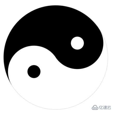
小编给大家分享一下用CSS纯代码画一个旋转的太极图的方法,相信大部分人都还不怎么了解,因此分享这篇文章给大家参考一下,希望大家阅读完这篇文章后大有收获,下面让我们一起去了解一下吧!
HTML部分:
<div class="square">
   <div class="rect rect_one">
    <div class="inner_circle rect_one_one">
     <div class="dot rect_one_two"></div>
    </div>
   </div>
   <div class="rect rect_two">
    <div class="inner_circle rect_two_one">
     <div class="dot rect_two_two"></div>
    </div>
   </div>
  </div>
  <div style="text-align:center;clear:both">
   <script src="/gg_bd_ad_720x90.js" type="text/javascript"></script>
   <script src="/follow.js" type="text/javascript"></script>
  </div>
CSS部分:
<style>
   .square {
    width: 400px;
    height: 400px;
    position: relative;
    transform: rotate(45deg);
    -webkit-transform: rotate(45deg);
    -moz-transform: rotate(45deg);
    animation: rotate infinite linear 5s;
    margin: 10% auto;
    -webkit-animation: rotate infinite linear 5s;
    margin: 10% auto;
    -moz-animation: rotate infinite linear 5s;
    margin: 10% auto;
   }
   .rect {
    width: 400px;
    height: 200px;
    position: relative;
    border: 1px #d2d2d2 solid;
    border-bottom: none;
   }
   .inner_circle {
    width: 200px;
    height: 200px;
    border-radius: 200px;
    position: absolute;
    z-index: 1;
   }
   .dot {
    width: 50px;
    height: 50px;
    position: absolute;
    left: 0;
    right: 0;
    top: 0;
    bottom: 0;
    margin: auto;
    border-radius: 50%;
   }
   .rect_one {
    border-radius: 200px 200px 0 0;
    background: white;
   }
   .rect_one_one {
    bottom: -100px;
    left: 0;
    background: black;
   }
   .rect_one_two {
    background: white;
   }
   .rect_two {
    border-radius: 0 0 200px 200px;
    background: black;
   }
   .rect_two_one {
    bottom: 100px;
    right: 0;
    background: white;
   }
   .rect_two_two {
    background: black;
   }
   @keyframes rotate {
    from {
     transform: rotate(0deg);
     -webkit-transform: rotate(0deg);
    }
    to {
     transform: rotate(360deg);
     -webkit-transform: rotate(360deg);
    }
   }
  </style>
看图看效果:
以上是用CSS纯代码画一个旋转的太极图的方法的所有内容,感谢各位的阅读!相信大家都有了一定的了解,希望分享的内容对大家有所帮助,如果还想学习更多知识,欢迎关注亿速云行业资讯频道!
免责声明:本站发布的内容(图片、视频和文字)以原创、转载和分享为主,文章观点不代表本网站立场,如果涉及侵权请联系站长邮箱:is@yisu.com进行举报,并提供相关证据,一经查实,将立刻删除涉嫌侵权内容。