您好,登录后才能下订单哦!
密码登录
登录注册
点击 登录注册 即表示同意《亿速云用户服务条款》
这篇文章给大家分享的是有关bootstrap的示例分析的内容。小编觉得挺实用的,因此分享给大家做个参考,一起跟随小编过来看看吧。
bootstrap提供了三种类型的下载:
1、用于生产环境的 Bootstrap
编译并压缩后的 CSS、JavaScript 和字体文件。不包含文档和源码文件。
2、Bootstrap 源码
Less、JavaScript 和 字体文件的源码,并且带有文档。需要 Less 编译器和一些设置工作。
3、Sass
这是 Bootstrap 从 Less 到 Sass 的源码移植项目,用于快速地在 Rails、Compass 或 只针对 Sass 的项目中引入。
其实我们不用下载bootstrap也可以使用它:
Bootstrap 中文网 为 Bootstrap 专门构建了自己的免费 CDN 加速服务。基于国内云厂商的 CDN 服务,访问速度更快、加速效果更明显、没有速度和带宽限制、永久免费。
base.html
<!DOCTYPE html>
<html lang="zh-CN">
 <head>
 <meta charset="utf-8">
 <meta http-equiv="X-UA-Compatible" content="IE=edge">
 <meta name="viewport" content="width=device-width, initial-scale=1">
 <!-- 上述3个meta标签*必须*放在最前面,任何其他内容都*必须*跟随其后! -->
 <title>Bootstrap 101 Template</title>

 <!-- Bootstrap -->
 <link rel="stylesheet" href="http://cdn.bootcss.com/bootstrap/3.3.4/css/bootstrap.min.css" rel="external nofollow" >

 </head>
 <body>
 <h2>你好,bootstrap!</h2>

 <!-- jQuery (necessary for Bootstrap's JavaScript plugins) -->
 <script src="http://cdn.bootcss.com/jquery/1.11.2/jquery.min.js"></script>
 <!-- Include all compiled plugins (below), or include individual files as needed -->
 <script src="http://cdn.bootcss.com/bootstrap/3.3.4/js/bootstrap.min.js"></script>
 </body>
</html>
base.html中已经引入了bootstrap,将其保存,我们就可以使用bootstrap提供的样式了。
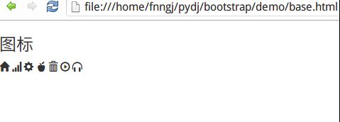
字体图标
bootstrap默认提供了二百多个图标。我们可以通过span标签来使用这些图标:
 <h4>图标</h4>
 <span class="glyphicon glyphicon-home"></span>
 <span class="glyphicon glyphicon-signal"></span>
 <span class="glyphicon glyphicon-cog"></span>
 <span class="glyphicon glyphicon-apple"></span>
 <span class="glyphicon glyphicon-trash"></span>
 <span class="glyphicon glyphicon-play-circle"></span>
 <span class="glyphicon glyphicon-headphones"></span>
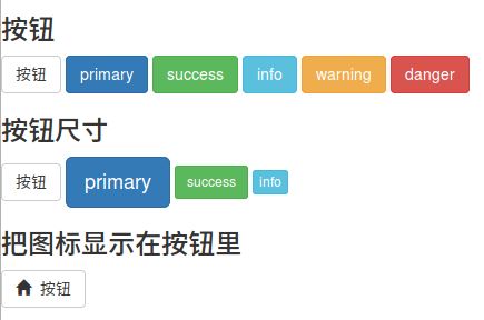
按钮
<button></button>标签用于创建按钮,bootstrap提供了丰富的按钮样式。 <h4>按钮</h4> <button type="button" class="btn btn-default">按钮</button> <button type="button" class="btn btn-primary">primary</button> <button type="button" class="btn btn-success">success</button> <button type="button" class="btn btn-info">info</button> <button type="button" class="btn btn-warning">warning</button> <button type="button" class="btn btn-danger">danger</button> <h4>按钮尺寸</h4> <button type="button" class="btn btn-default">按钮</button> <button type="button" class="btn btn-primary btn-lg">primary</button> <button type="button" class="btn btn-success btn-sm">success</button> <button type="button" class="btn btn-info btn-xs">info</button> <h4>把图标显示在按钮里</h4> <button type="button" class="btn btn-default"><span class="glyphicon glyphicon-home"></span> 按钮</button>
按钮除了有默认的大小外,bootstrap还提供三个参数来调整按钮的大小,分别是:btn-lg、btn-sm和btn-xs。
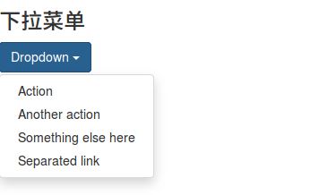
下拉菜单
下拉菜单是最常见的交互之一,bootstrap提供了漂亮的样式。
  <h4>下拉菜单</h4>
 <div class="dropdown">
  <button class="btn btn-primary dropdown-toggle" type="button" id="dropdownMenu1" data-toggle="dropdown" aria-expanded="true">
  Dropdown
  <span class="caret"></span>
  </button>
  <ul class="dropdown-menu" role="menu" aria-labelledby="dropdownMenu1">
  <li role="presentation"><a role="menuitem" tabindex="-1" href="#" rel="external nofollow" rel="external nofollow" rel="external nofollow" rel="external nofollow" rel="external nofollow" rel="external nofollow" rel="external nofollow" rel="external nofollow" rel="external nofollow" rel="external nofollow" rel="external nofollow" rel="external nofollow" rel="external nofollow" >Action</a></li>
  <li role="presentation"><a role="menuitem" tabindex="-1" href="#" rel="external nofollow" rel="external nofollow" rel="external nofollow" rel="external nofollow" rel="external nofollow" rel="external nofollow" rel="external nofollow" rel="external nofollow" rel="external nofollow" rel="external nofollow" rel="external nofollow" rel="external nofollow" rel="external nofollow" >Another action</a></li>
  <li role="presentation"><a role="menuitem" tabindex="-1" href="#" rel="external nofollow" rel="external nofollow" rel="external nofollow" rel="external nofollow" rel="external nofollow" rel="external nofollow" rel="external nofollow" rel="external nofollow" rel="external nofollow" rel="external nofollow" rel="external nofollow" rel="external nofollow" rel="external nofollow" >Something else here</a></li>
  <li role="presentation"><a role="menuitem" tabindex="-1" href="#" rel="external nofollow" rel="external nofollow" rel="external nofollow" rel="external nofollow" rel="external nofollow" rel="external nofollow" rel="external nofollow" rel="external nofollow" rel="external nofollow" rel="external nofollow" rel="external nofollow" rel="external nofollow" rel="external nofollow" >Separated link</a></li>
  </ul>
 </div>
输入框
通过<input></input>标签去创建输入框。
 <h4>输入框</h4>
 <div class="input-group">
  <span class="glyphicon glyphicon-user"></span>
  <input type="text" placeholder="username">
 </div>

 <div class="input-group">
  <span class="glyphicon glyphicon-lock"></span>
  <input type="password" placeholder="password">
 </div>

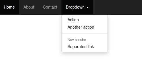
导航栏
导航栏作为整个网站的指引必不可少。
 <h4>导航栏</h4>
 <nav class="navbar navbar-inverse navbar-fixed-top">
  <div id="navbar" class="navbar-collapse collapse">
   <ul class="nav navbar-nav">
   <li class="active"><a href="#" rel="external nofollow" rel="external nofollow" rel="external nofollow" rel="external nofollow" rel="external nofollow" rel="external nofollow" rel="external nofollow" rel="external nofollow" rel="external nofollow" rel="external nofollow" rel="external nofollow" rel="external nofollow" rel="external nofollow" >Home</a></li>
   <li><a href="#about" rel="external nofollow" >About</a></li>
   <li><a href="#contact" rel="external nofollow" >Contact</a></li>
   <li class="dropdown">
    <a href="#" rel="external nofollow" rel="external nofollow" rel="external nofollow" rel="external nofollow" rel="external nofollow" rel="external nofollow" rel="external nofollow" rel="external nofollow" rel="external nofollow" rel="external nofollow" rel="external nofollow" rel="external nofollow" rel="external nofollow" class="dropdown-toggle" data-toggle="dropdown" role="button" aria-expanded="false">Dropdown <span class="caret"></span></a>
    <ul class="dropdown-menu" role="menu">
    <li><a href="#" rel="external nofollow" rel="external nofollow" rel="external nofollow" rel="external nofollow" rel="external nofollow" rel="external nofollow" rel="external nofollow" rel="external nofollow" rel="external nofollow" rel="external nofollow" rel="external nofollow" rel="external nofollow" rel="external nofollow" >Action</a></li>
    <li><a href="#" rel="external nofollow" rel="external nofollow" rel="external nofollow" rel="external nofollow" rel="external nofollow" rel="external nofollow" rel="external nofollow" rel="external nofollow" rel="external nofollow" rel="external nofollow" rel="external nofollow" rel="external nofollow" rel="external nofollow" >Another action</a></li>
    <li class="divider"></li>
    <li class="dropdown-header">Nav header</li>
    <li><a href="#" rel="external nofollow" rel="external nofollow" rel="external nofollow" rel="external nofollow" rel="external nofollow" rel="external nofollow" rel="external nofollow" rel="external nofollow" rel="external nofollow" rel="external nofollow" rel="external nofollow" rel="external nofollow" rel="external nofollow" >Separated link</a></li>
    </ul>
   </li>
   </ul>
  </div><!--/.nav-collapse -->
  </div>
 </nav>
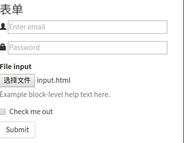
表单
人与系统之间数据的传递都需要依靠表单来完成。比如注册/登录信息的提交,查询条件的提交等。用<form></form>标签来创建表单。
 <h4>表单</h4>
 <form>
 <div class="form-group">
  <span class="glyphicon glyphicon-user"></span>
  <input type="email" id="exampleInputEmail1" placeholder="Enter email">
 </div>
 <div class="form-group">
  <span class="glyphicon glyphicon-lock"></span>
  <input type="password" id="exampleInputPassword1" placeholder="Password">
 </div>
 <div class="form-group">
  <label for="exampleInputFile">File input</label>
  <input type="file" id="exampleInputFile">
  <p class="help-block">Example block-level help text here.</p>
 </div>
 <div class="checkbox">
  <label>
  <input type="checkbox"> Check me out
  </label>
 </div>
 <button type="submit" class="btn btn-default">Submit</button>
 </form>
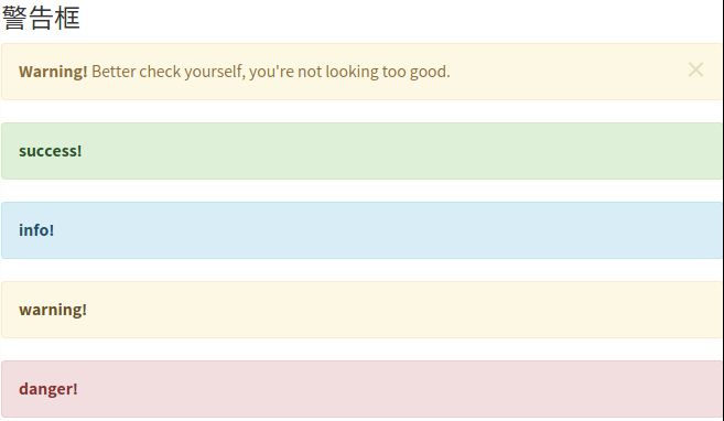
警告框
警告框是系统向用户传达信息和提供指引的重要手段。没有针对警告框的标签,通过bootstrap所提供的样式可以瞬间制作出漂亮的警告框。
<h4>警告框</h4> <div class="alert alert-warning alert-dismissible" role="alert"> <button type="button" class="close" data-dismiss="alert" aria-label="Close"><span aria-hidden="true">×</span></button> <strong>Warning!</strong> Better check yourself, you're not looking too good. </div> <div class="alert alert-success" role="alert"> <a href="#" rel="external nofollow" rel="external nofollow" rel="external nofollow" rel="external nofollow" rel="external nofollow" rel="external nofollow" rel="external nofollow" rel="external nofollow" rel="external nofollow" rel="external nofollow" rel="external nofollow" rel="external nofollow" rel="external nofollow" class="alert-link">success!</a> </div> <div class="alert alert-info" role="alert"> <a href="#" rel="external nofollow" rel="external nofollow" rel="external nofollow" rel="external nofollow" rel="external nofollow" rel="external nofollow" rel="external nofollow" rel="external nofollow" rel="external nofollow" rel="external nofollow" rel="external nofollow" rel="external nofollow" rel="external nofollow" class="alert-link">info!</a> </div> <div class="alert alert-warning" role="alert"> <a href="#" rel="external nofollow" rel="external nofollow" rel="external nofollow" rel="external nofollow" rel="external nofollow" rel="external nofollow" rel="external nofollow" rel="external nofollow" rel="external nofollow" rel="external nofollow" rel="external nofollow" rel="external nofollow" rel="external nofollow" class="alert-link">warning!</a> </div> <div class="alert alert-danger" role="alert"> <a href="#" rel="external nofollow" rel="external nofollow" rel="external nofollow" rel="external nofollow" rel="external nofollow" rel="external nofollow" rel="external nofollow" rel="external nofollow" rel="external nofollow" rel="external nofollow" rel="external nofollow" rel="external nofollow" rel="external nofollow" class="alert-link">danger!</a> </div>
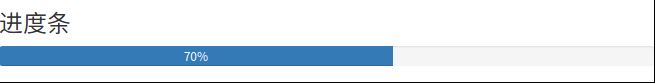
进度条
系统的处理过程往往需要用户等待,进度条可以让用户感知到系统的处理过程,从而增加容忍度。
 <h4>进度条</h4>
 <div class="progress">
  <div class="progress-bar" role="progressbar" aria-valuenow="70" aria-valuemin="0" aria-valuemax="100" >
  70%
  </div>
 </div>
感谢各位的阅读!关于“bootstrap的示例分析”这篇文章就分享到这里了,希望以上内容可以对大家有一定的帮助,让大家可以学到更多知识,如果觉得文章不错,可以把它分享出去让更多的人看到吧!
免责声明:本站发布的内容(图片、视频和文字)以原创、转载和分享为主,文章观点不代表本网站立场,如果涉及侵权请联系站长邮箱:is@yisu.com进行举报,并提供相关证据,一经查实,将立刻删除涉嫌侵权内容。