您好,登录后才能下订单哦!
密码登录
登录注册
点击 登录注册 即表示同意《亿速云用户服务条款》
本篇内容主要讲解“利用CSS3实现闪烁跳跃的进度条”,感兴趣的朋友不妨来看看。本文介绍的方法操作简单快捷,实用性强。下面就让小编来带大家学习“利用CSS3实现闪烁跳跃的进度条”吧!
今天为大家带来一款具个性化的进度条:CSS3闪烁跳跃的进度条。
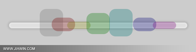
HTML结构代码
<div class="center"> <ul> <li> <div></div> </li> <li> <div></div> </li> <li> <div></div> </li> <li> <div></div> </li> <li> <div></div> </li> <li> <div></div> </li> <li> <div></div> </li> </ul> </div>
CSS样式代码
@keyframes bump { 0% { opacity: 0; left: 535px; } 100% { left: -10px; opacity: 0; } 10%, 85% { opacity: 1; } } @keyframes spin { 0%, 100% { height: 20px; top: 50px; } 50% { height: 100px; top: 0; } } body { background: rgba(0, 0, 0, 0.2); } div.center { text-align: center; margin-top: 40px; } ul { background-color: rgba(255, 255, 255, 0.4); position: relative; display: block; padding: 0; margin: auto; width: 600px; height: 10px; list-style: none; border-radius: 200px; border: 5px solid rgba(255, 255, 255, 0.2); margin-top: 100px; box-shadow: 0 0 5px 5px rgba(0, 0, 0, 0.1); } ul li { position: absolute; margin-top: -55px; } ul li:nth-child(1) { animation: bump 1.5s infinite; animation-delay: 0.1s; } ul li:nth-child(1) div { border-radius: 22px; transform-origin: center; position: absolute; height: 60px; width: 80px; animation: spin 0.4s infinite; animation-delay: 0.1s; background-color: rgba(120, 120, 120, 0.3); } ul li:nth-child(2) { animation: bump 1.5s infinite; animation-delay: 0.2s; } ul li:nth-child(2) div { border-radius: 22px; transform-origin: center; position: absolute; height: 60px; width: 80px; animation: spin 0.4s infinite; animation-delay: 0.2s; background-color: rgba(120, 0, 0, 0.3); } ul li:nth-child(3) { animation: bump 1.5s infinite; animation-delay: 0.3s; } ul li:nth-child(3) div { border-radius: 22px; transform-origin: center; position: absolute; height: 60px; width: 80px; animation: spin 0.4s infinite; animation-delay: 0.3s; background-color: rgba(120, 120, 0, 0.3); } ul li:nth-child(4) { animation: bump 1.5s infinite; animation-delay: 0.4s; } ul li:nth-child(4) div { border-radius: 22px; transform-origin: center; position: absolute; height: 60px; width: 80px; animation: spin 0.4s infinite; animation-delay: 0.4s; background-color: rgba(0, 120, 0, 0.3); } ul li:nth-child(5) { animation: bump 1.5s infinite; animation-delay: 0.5s; } ul li:nth-child(5) div { border-radius: 22px; transform-origin: center; position: absolute; height: 60px; width: 80px; animation: spin 0.4s infinite; animation-delay: 0.5s; background-color: rgba(0, 120, 120, 0.3); } ul li:nth-child(6) { animation: bump 1.5s infinite; animation-delay: 0.6s; } ul li:nth-child(6) div { border-radius: 22px; transform-origin: center; position: absolute; height: 60px; width: 80px; animation: spin 0.4s infinite; animation-delay: 0.6s; background-color: rgba(0, 0, 120, 0.3); } ul li:nth-child(7) { animation: bump 1.5s infinite; animation-delay: 0.7s; } ul li:nth-child(7) div { border-radius: 22px; transform-origin: center; position: absolute; height: 60px; width: 80px; animation: spin 0.4s infinite; animation-delay: 0.7s; background-color: rgba(120, 0, 120, 0.3); }注:请自行在所需之处加上浏览器前缀(如:-webkit- 、 -moz-),否则将不能正常显示效果。
到此,相信大家对“利用CSS3实现闪烁跳跃的进度条”有了更深的了解,不妨来实际操作一番吧!这里是亿速云网站,更多相关内容可以进入相关频道进行查询,关注我们,继续学习!
免责声明:本站发布的内容(图片、视频和文字)以原创、转载和分享为主,文章观点不代表本网站立场,如果涉及侵权请联系站长邮箱:is@yisu.com进行举报,并提供相关证据,一经查实,将立刻删除涉嫌侵权内容。