您好,登录后才能下订单哦!
密码登录
登录注册
点击 登录注册 即表示同意《亿速云用户服务条款》
这篇文章主要介绍“css3怎么实现wifi信号逐渐增强效果”的相关知识,小编通过实际案例向大家展示操作过程,操作方法简单快捷,实用性强,希望这篇“css3怎么实现wifi信号逐渐增强效果”文章能帮助大家解决问题。
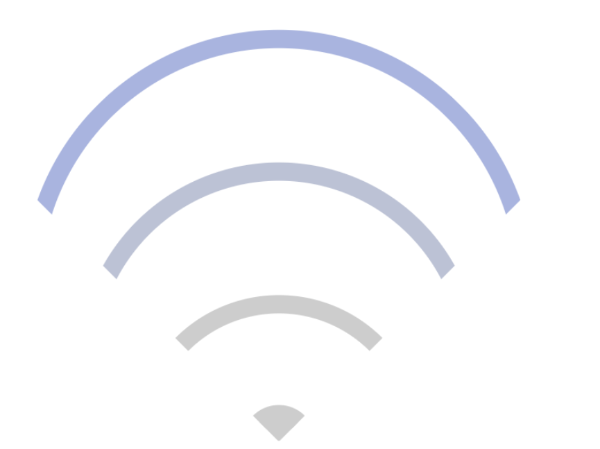
效果图
下面是实现代码:
<!DOCTYPE html>
<meta charset="utf-8">
<html>
<head>
    <title>wifi信号</title>
    <style type="text/css">
        *{
            margin: 0;
            padding: 0;
        }
        .box {
            width: 240px;
            height: 240px;
            box-sizing: border-box;
            position: relative;
            margin: 100px auto;
        }
        .wifi-symbol {
            width: 200px;
            height: 200px;
            margin-left: 18px;
            box-sizing: border-box;
            overflow: hidden;
            transform: rotate(45deg);

        }
        .wifi-circle {
            border: 10px solid #ccc;
            border-radius: 50%;
            position: absolute;
        }
        .first {
            width: 260px;
            height: 260px;
            top: 0;
            left: 0;
            animation: run1 4s linear infinite;
        }
        @keyframes run1 {
            0% {
                border-color: #ccc;
            }
            25% {
                border-color: #ccc;
            }
            50% {
                border-color: #ccc;
            }
            75% {
                border-color: #ccc;
            }
            100% {
                border-color: #97a8e6;
            }
        }
        .second {
            width: 200px;
            height: 200px;
            top: 60px;
            left: 60px;
            animation: run2 4s linear infinite;
        }
        @keyframes run2 {
            0% {
                border-color: #ccc;
            }
            25% {
                border-color: #ccc;
            }
            50% {
                border-color: #ccc;
            }
            75% {
                border-color: #97a8e6;
            }
            100% {
                border-color: #ccc;
            }
        }
        .third {
            width: 140px;
            height: 140px;
            top: 120px;
            left: 120px;
            animation: run3 4s linear infinite;
        }
        @keyframes run3 {
            0% {
                border-color: #ccc;
            }
            25% {
                border-color: #ccc;
            }
            50% {
                border-color: #97a8e6;
            }
            75% {
                border-color: #ccc;
            }
            100% {
                border-color: #ccc;
            }
        }
        .fourth {
            width: 20px;
            height: 20px;
            background: #ccc;
            top: 180px;
            left: 180px;
            animation: run4 4s linear infinite;
        }
        @keyframes run4 {
            0% {
                background: #ccc;
                border-color: #ccc;
            }
            25% {
                background: #97a8e6;
                border-color: #97a8e6;
            }
            50% {
                background: #ccc;
                border-color: #ccc;
            }
            75% {
                background: #ccc;
                border-color: #ccc;
            }
            100% {
                background: #ccc;
                border-color: #ccc;
            }
        }
    </style>
</head>
<body>
    <div class="box">
        <div class="wifi-symbol">
          <div class="wifi-circle first"></div>
          <div class="wifi-circle second"></div>
          <div class="wifi-circle third"></div>
          <div class="wifi-circle fourth">
        </div>
    </div>

</body>
</html>
关于“css3怎么实现wifi信号逐渐增强效果”的内容就介绍到这里了,感谢大家的阅读。如果想了解更多行业相关的知识,可以关注亿速云行业资讯频道,小编每天都会为大家更新不同的知识点。
免责声明:本站发布的内容(图片、视频和文字)以原创、转载和分享为主,文章观点不代表本网站立场,如果涉及侵权请联系站长邮箱:is@yisu.com进行举报,并提供相关证据,一经查实,将立刻删除涉嫌侵权内容。