您好,登录后才能下订单哦!
密码登录
登录注册
点击 登录注册 即表示同意《亿速云用户服务条款》
这篇文章主要介绍vue如何自定义封装按钮组件,文中介绍的非常详细,具有一定的参考价值,感兴趣的小伙伴们一定要看完!
具体内容如下
封装按钮组件 button.vue
<template>
  <button class="button ellipsis" :class="[size,type]">
    <slot />
  </button>
</template>
<script>
export default {
  name: 'Button',
  props: {
    size: {
      type: String,
      default: 'middle'
    },
    type: {
      type: String,
      default: 'default'
    }
  }
}
</script>
<style scoped lang="less">
.button {
  appearance: none;
  border: none;
  outline: none;
  background: #fff;
  text-align: center;
  border: 1px solid transparent;
  border-radius: 4px;
  cursor: pointer;
}
.large {
  width: 240px;
  height: 50px;
  font-size: 16px;
}
.middle {
  width: 180px;
  height: 50px;
  font-size: 16px;
}
.small {
  width: 100px;
  height: 32px;
  font-size: 14px;
}
.mini {
  width: 60px;
  height: 32px;
  font-size: 14px;
}
.default {
  border-color: #e4e4e4;
  color: #666;
}
.primary {
  border-color: #27BA9B;;
  background: #27BA9B;;
  color: #fff;
}
.plain {
  border-color:#27BA9B;;
  color:#27BA9B;;
  background: lighten(#27BA9B;,50%);
}
.gray {
  border-color: #ccc;
  background: #ccc;;
  color: #fff;
}
</style>
封装组件的使用
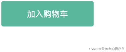
<Button type="primary" >自定义按钮名字</Button>
<Button type="primary" >加入购物车</Button>
实现效果
以上是“vue如何自定义封装按钮组件”这篇文章的所有内容,感谢各位的阅读!希望分享的内容对大家有帮助,更多相关知识,欢迎关注亿速云行业资讯频道!
免责声明:本站发布的内容(图片、视频和文字)以原创、转载和分享为主,文章观点不代表本网站立场,如果涉及侵权请联系站长邮箱:is@yisu.com进行举报,并提供相关证据,一经查实,将立刻删除涉嫌侵权内容。