您好,登录后才能下订单哦!
密码登录
登录注册
点击 登录注册 即表示同意《亿速云用户服务条款》
这篇文章主要介绍了vue+echarts怎么实现3D柱形图的相关知识,内容详细易懂,操作简单快捷,具有一定借鉴价值,相信大家阅读完这篇vue+echarts怎么实现3D柱形图文章都会有所收获,下面我们一起来看看吧。
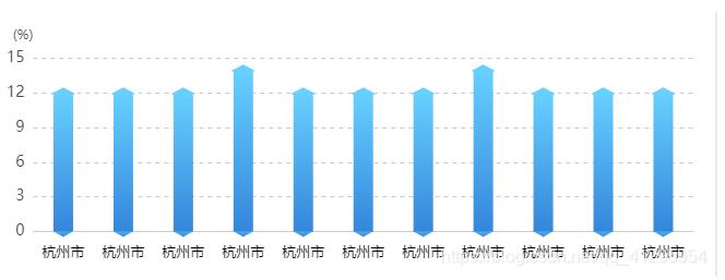
效果如下:
1、安装echarts
npm install echarts --save
2、引入echarts
import echarts from "echarts";
//修改原型链,可在全局使用
Vue.prototype.$echarts = echarts;
3、创建图表 首先需要在 HTML 中创建图表的容器
<div id="echarts_park"></div>
     //图表的容器必须指定宽高
     #echarts_park {
         width: 400px;
         height: 200px;
}
4、渲染图表
mounted() {
    this.drawPark();
  },
  methods: {
    drawPark() {
        //初始化echarts
      let myChart = this.$echarts.init(document.getElementById("echarts_park"));
      let num= [
        "12",
        "12",
        "12",
        "14",
        "12",
        "12",
        "12",
        "14",
        "12",
        "12",
        "12",
      ];
      let xData = [
        "杭州市",
        "杭州市",
        "杭州市",
        "杭州市",
        "杭州市",
        "杭州市",
        "杭州市",
        "杭州市",
        "杭州市",
        "杭州市",
        "杭州市",
      ];
      var colors = [
        {
          type: "linear",
          x: 0,
          x2: 1,
          y: 0,
          y2: 0,
          colorStops: [
            {
              offset: 0,
              color: "#0088F1",
            },
            {
              offset: 1,
              color: "#00D1FF",
            },
          ],
        },
        {
          type: "linear",
          x: 0,
          x2: 0,
          y: 0,
          y2: 1,
          colorStops: [
            {
              offset: 0,
              color: "#67D0FF",
            },
            {
              offset: 1,
              color: "#3486DA",
            },
          ],
        },
      ];
      var barWidth = 18;
      // 绘制图表
      myChart.setOption({
        tooltip: {
          trigger: "axis",
          axisPointer: {
            // 坐标轴指示器,坐标轴触发有效
            type: "shadow", // 默认为直线,可选为:'line' | 'shadow'
          },
          formatter: function (params) {
            var tipString = params[0].axisValue + "<br />";
            var key = "value";
            params.sort(function (obj1, obj2) {
              var val1 = obj1[key];
              var val2 = obj2[key];
              if (val1 < val2) {
                return 1;
              } else if (val1 > val2) {
                return -1;
              } else {
                return 0;
              }
            });
            var indexColor;
            for (var i = 0, length = params.length; i < length; i++) {
              if (params[i].componentSubType == "bar") {
                indexColor = params[i + 1].color;
                tipString +=
                  '<span style="display:inline-block;margin-right:5px;border-radius:10px;width:9px;height:9px;background:' +
                  indexColor +
                  '"></span>';
                tipString +=
                  '<span data-type ="lineTip" data-val=' +
                  params[i].value +
                  ">" +
                  params[i].seriesName +
                  ":" +
                  params[i].value +
                  "</span><br />";
              }
            }
            return tipString;
          },
        },
        grid: {
          left: "3%",
          right: "3%",
          bottom: "6%",
          top: "20%",
          containLabel: true,
        },
        xAxis: {
          type: "category",
          data: xData,
          offset: 6,
          axisLine: { lineStyle: { color: " #CCCCCC" } },
          axisTick: {
            alignWithLabel: true,
          },
          axisLabel: {
            interval: 0,
            // rotate: 20,
            textStyle: {
              color: "#000",
              fontStyle: "normal",
              fontFamily: "微软雅黑",
              fontSize: 13,
              margin: 10,
            },
          },
        },

        yAxis: {
          type: "value",
          name: "(%)",
          nameTextStyle: {
            align: "right",
            color: "#4D4D4D",
          },
          axisLine: {
            show: false,
            lineStyle: { color: "#CCCCCC" },
          },
          axisTick: { show: false },
          splitLine: {
            show: true,
            lineStyle: { type: "dashed", color: "#CCCCCC" },
          },
          axisLabel: {
            textStyle: {
              color: "#4D4D4D",
              fontSize: 14,
            },
          },
        },
        series: [
          {
            name: "2020",
            type: "bar",
            barGap: "14%",
            barWidth: 18,
            itemStyle: {
              normal: {
                color: colors[1],
                barBorderRadius: 0,
              },
            },
            data: num,
          },
          {
            z: 2,
            name: "2020",
            type: "pictorialBar",
            data: [1, 1, 1, 1, 1, 1, 1, 1, 1, 1, 1],
            symbol: "diamond",
            symbolOffset: ["0%", "50%"],
            symbolSize: [barWidth, 10],
            itemStyle: {
              normal: {
                color: colors[1],
              },
            },
          },
          {
            z: 3,
            name: "2020",
            type: "pictorialBar",
            symbolPosition: "end",
            data: qichu,
            symbol: "diamond",
            symbolOffset: ["0%", "-50%"],
            symbolSize: [barWidth, (10 * (barWidth - 1)) / barWidth],
            itemStyle: {
              normal: {
                borderColor: "#67D0FF",
                borderWidth: 2,
                color: "#67D0FF",
              },
            },
          },
        ],
      });
    },
},
关于“vue+echarts怎么实现3D柱形图”这篇文章的内容就介绍到这里,感谢各位的阅读!相信大家对“vue+echarts怎么实现3D柱形图”知识都有一定的了解,大家如果还想学习更多知识,欢迎关注亿速云行业资讯频道。
免责声明:本站发布的内容(图片、视频和文字)以原创、转载和分享为主,文章观点不代表本网站立场,如果涉及侵权请联系站长邮箱:is@yisu.com进行举报,并提供相关证据,一经查实,将立刻删除涉嫌侵权内容。