您好,登录后才能下订单哦!
密码登录
登录注册
点击 登录注册 即表示同意《亿速云用户服务条款》
这篇文章主要讲解了“Vue和Element怎么自定义上传封面组件功能”,文中的讲解内容简单清晰,易于学习与理解,下面请大家跟着小编的思路慢慢深入,一起来研究和学习“Vue和Element怎么自定义上传封面组件功能”吧!
先来看一下效果:
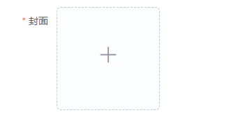
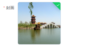
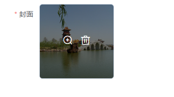
第一张图片是上传之前,第二张图片是上传成功后,第3张图片是鼠标放上去之后的效果!首先整理需求,图片上传我们使用照片墙的方式,只能上传一张图片,图片上传成功后不能继续上传,如果想要更换图片,则需要将图片删除后重新上传。点击图片上面的放大镜可以查看大图。需要限制图片上传的格式,图片的大小。组件代码:
<template>
  <div class="upload">
    <el-upload
      :class="{'hidden':mFileList.length > 0}"
      list-type="picture-card"
      :on-remove="handleRemove"
      :action="action"
      :before-upload="beforeUploadHandle"
      :on-success="successHandle"
      :on-change="changeHandle"
      :limit="1"
      :accept="accept"
      :on-exceed="handleExceed"
      :file-list="fileList"
      :on-preview="handlePictureCardPreview"
    >
      <i class="el-icon-plus"></i>
    </el-upload>
    <el-dialog :visible.sync="dialogVisible">
      <img width="100%" :src="dialogImageUrl" alt="" />
    </el-dialog>
  </div>
</template>

<script>
export default {
  props: {
    action: {
      type: String,
      default: "",
    },
    accept: {
      type: String,
      default: "",
    },
    fileList:{
      type: Array,
      default: () => [],
    },
  },
  watch: {
    fileList(newValue, oldValue) {
      this.mFileList = newValue
    }
  },
  data() {
    return {
      dialogVisible: false, //图片放大
      fileImg: "", //上传图片
      dialogImageUrl: "", //图片地址
      mFileList:this.fileList,
    };
  },
  methods: {
    handleRemove(file, fileList) {
      this.$emit("upload-remove", file);
    },
    handlePictureCardPreview(file) {
      this.dialogImageUrl = file.url;
      this.dialogVisible = true;
    },
    // 上传之前
    beforeUploadHandle(file) {
      if (file.type !== "image/jpeg" && file.type !== "image/png") {
        this.$message({
          message: "只支持jpg、png格式的图片!",
          type: "warning",
        });
        return false;
      }
      const isLt2M = file.size / 1024 / 1024 < 2;
      if (!isLt2M) {
        this.$message({
          message: "上传文件大小不能超过 2MB!",
          type: "warning",
        });
        return false;
      }
    },
    // 上传成功
    successHandle(response, file, fileList) {
      this.mFileList = fileList;
      if (response && response.code === 200) {
        this.$message.success("图片上传成功!");
        this.$emit("upload-success", response, file);
      } else {
        this.$message.error(response.msg);
      }
    },
    changeHandle(file, fileList) {
      if(file.response && file.response.code == 500) {
         this.$emit("upload-error",file);
      }
    },
    handleExceed(files, fileList) {
        this.$message.warning("只能上传1张图片!");
      },
  },
};
</script>
<style lang="scss">
.upload .hidden .el-upload--picture-card {
  display: none;
}
</style>
调用组件代码:
<template>
    <div>
        <el-form ref="dataForm"    label-width="80px">
            <el-form-item label="封面" prop="cover" class="is-required">
                <upload list-type="picture-card" :action="url" :accept="'.jpg,.png,.JPG,.PNG'" :fileList="fileList"
                    :limit="1" @upload-success="uploadFile" @upload-remove="removeFile" @upload-error="uploadError">
                </upload>
            </el-form-item>
        </el-form>
    </div>
</template>

<script>
    import Upload from '../components/cover-upload/index.vue'
    export default {
        components: {
            Upload
        },
        data() {
            return {
                url: "",
                fileList: [],
            }
        },
        methods: {
            uploadUrl() {
                this.url = "http://xxx.xxx.xxx.xxx:xxx/yyxt/admin/course/courseInfo/upload?token=075de0303b15a38833a30a7a3b494794"//上传图片的后台接口
            },
            uploadError(file) {
                this.fileList = [];
            },
            uploadFile(response, file) {
                this.fileList = [{
                    url: response.data,
                }, ];
            },
            removeFile(file) {
                this.fileList = [];
            },
        },
        mounted() {
            this.uploadUrl();
        }
    }
</script>
感谢各位的阅读,以上就是“Vue和Element怎么自定义上传封面组件功能”的内容了,经过本文的学习后,相信大家对Vue和Element怎么自定义上传封面组件功能这一问题有了更深刻的体会,具体使用情况还需要大家实践验证。这里是亿速云,小编将为大家推送更多相关知识点的文章,欢迎关注!
免责声明:本站发布的内容(图片、视频和文字)以原创、转载和分享为主,文章观点不代表本网站立场,如果涉及侵权请联系站长邮箱:is@yisu.com进行举报,并提供相关证据,一经查实,将立刻删除涉嫌侵权内容。