您好,登录后才能下订单哦!
密码登录
登录注册
点击 登录注册 即表示同意《亿速云用户服务条款》
这篇文章主要介绍“CSS3使用实例分析”的相关知识,小编通过实际案例向大家展示操作过程,操作方法简单快捷,实用性强,希望这篇“CSS3使用实例分析”文章能帮助大家解决问题。
-webkit-(chrome和Safari)、-moz-(firefox)、-ms-(IE)、-o-(opera)
圆角:border-radius: 5px 4px 3px 2px; /* 顺时针 */
阴影:box-shadow: X轴偏移量 Y轴偏移量
[阴影模糊半径] [阴影扩展半径] [阴影颜色] [投影方式];
/* 默认外阴影*/外阴影 :box-shadow:4px 2px 6px #333333;
内阴影: box-shadow:4px 2px 6px #333333 inset;
多阴影: box-shadow:4px 2px 6px #f00, -4px -2px 6px #000, 0px 0px 12px 5px #33CC00 inset;
边界图片:border-image: 图片路径 像素顺时针 延伸方式(repeat重复
round平铺 stretch 拉伸) border-image:url(border.png) 30 30 round; -webkit-border-image:url(border.png) 30 30 round; /* Safari 5 and older */ -o-border-image:url(border.png) 30 30 round; /* Opera */
大小: background-size: auto | <长度值> | <百分比> | cover | contain 原点: background-origin : border-box | padding-box | content-box;
裁剪: background-clip : border-box | padding-box | content-box | no-clip 多重背景: background : [background-color] | [background-image] |
[background-position][/background-size] | [background-repeat] |
[background-attachment] | [background-clip] | [background-origin],...
【例】background:url(logoindex.png) no-repeat left top/75% 50% , url(logoindex.png) no-repeat right bottom/50% 45%;
线性渐变: //默认从上到下、可以改变方向和角度
background: -webkit-linear-gradient(red, blue); /* Safari 5.1 - 6.0 */ background: -o-linear-gradient(red, blue); /* Opera 11.1 - 12.0 */ background: -moz-linear-gradient(red, blue); /* Firefox 3.6 - 15 */ background: linear-gradient(red, blue); /* 标准的语法 */

径向渐变: background: -webkit-radial-gradient(red, green, blue); /* Safari 5.1 - 6.0 */ background: -o-radial-gradient(red, green, blue); /* Opera 11.6 - 12.0 */ background: -moz-radial-gradient(red, green, blue); /* Firefox 3.6 - 15 */ background: radial-gradient(red, green, blue); /* 标准的语法 */
阴影:text-shadow:X偏移 Y偏移 模糊程度 阴影颜色; text-shadow: 5px 5px 5px #FF0000;文本溢出:text-overflow:ellipsis; overflow:hidden; white-space:nowrap;
@font-face { font-family : 字体名称; src : 字体文件在服务器上的相对或绝对路径;}调用:font-family: 字体名称;
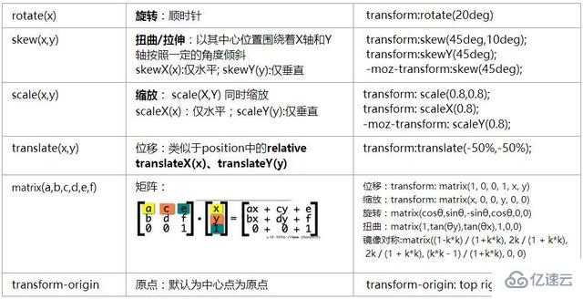
位移:translate3d(x,y,z)、translateZ(z)缩放:scale3d(x,y,z)、scaleZ(z)旋转:rotate3d(x,y,z,angle)、rotateZ(angle)

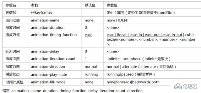
【例】@keyframes myfirst、@-webkit-keyframes myfirst div{ animation: myfirst 5s linear 2s infinite alternate; -webkit-animation: myfirst 5s linear 2s infinite alternate;}多列布局 columns:(column-width) || (column-count); column-width: auto | (length); column-count:auto | (integer);列间距 column-gap: normal || (length)列表边框 column-rule:(column-rule-width)|(column-rule-style)|(column-rule-color)跨列设置 column-span: none | all
outline: [outline-color] || [outline-style] || [outline-width] || [outline-offset] || inherit

outline:2px solid red;outline-offset:15px;
box-sizing: content-box | border-box | inherit
resize:none | both | horizontal | vertical | inherit
关于“CSS3使用实例分析”的内容就介绍到这里了,感谢大家的阅读。如果想了解更多行业相关的知识,可以关注亿速云行业资讯频道,小编每天都会为大家更新不同的知识点。
免责声明:本站发布的内容(图片、视频和文字)以原创、转载和分享为主,文章观点不代表本网站立场,如果涉及侵权请联系站长邮箱:is@yisu.com进行举报,并提供相关证据,一经查实,将立刻删除涉嫌侵权内容。